Before and After Images
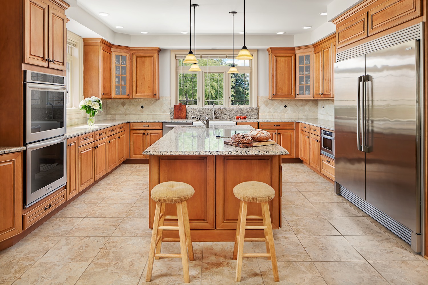
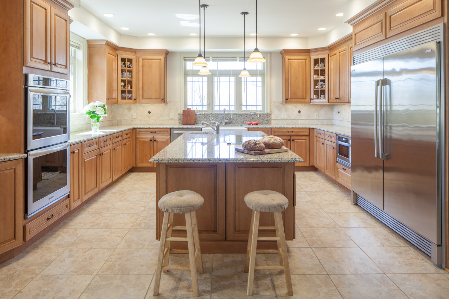
Since so much of the magic of good photography happens behind the scenes it can be helpful to look behind the curtain and get a good look at what exactly is being done, without boring you with all of the technical details. Nothing quite makes the point like being able to see before and after shots, where you can scrutinize the differences that all of the work makes. Everything that goes into making an architectural or interior design photograph. These images try to show the difference the right photographer, one specializing in architecture can make. In this first example, the before image is made with the same camera and tripod. And was shot with a top of the line tilt-shift lens but as you can see, it lacks punch and vibrancy. This is where you can really see that careful lighting can take a shot from good to great. The "After" shot is made up of a combination of different exposures that have been combined in the digital darkroom, better known as photoshop. The difference is dramatic but this isn't an entirely fair comparison since the first version benefits from the same composition and was carefully set up before shooting. It benefits from my years of experience of "framing the shot". Another benefit of an architectural specialist like myself, that is visible in both the before and after shot is that the perspective is fixed with perspective correcting lenses and all of the angles are perfectly straight without barrel distortion. Architectural photography is a specialty that has high aesthetic standards and while distortion might be fine in real estate it is absolutely verboten in professional architectural imagery. Details matter in commercial photography, if you look at the before there is a haze around the windows that causes a glare throughout the image. Glare is the enemy of photographers because it kills contrast and dulls colors. Also, there is a bluish cast in the before image because of a problem common to interior photography. The issue, is that the interior lighting is much warmer than the light outside the windows, making the exterior light appear blue in contrast. With careful lighting the difference can be mitigated or completely remedied, this way everything can look natural and feel as if you were there. In the end the goal is to make images that look great and show reality in a flattering way. The way I see it, every last detail was considered by the architect or designer, it is my job to make sure that the fruits of that labor are obvious in every photograph. The before photo is not terrible, but by correcting the color and contrast and getting rid of the haze the image becomes fit to represent the architect or designer in their portfolio where great photos could be the difference between winning the bid or not.
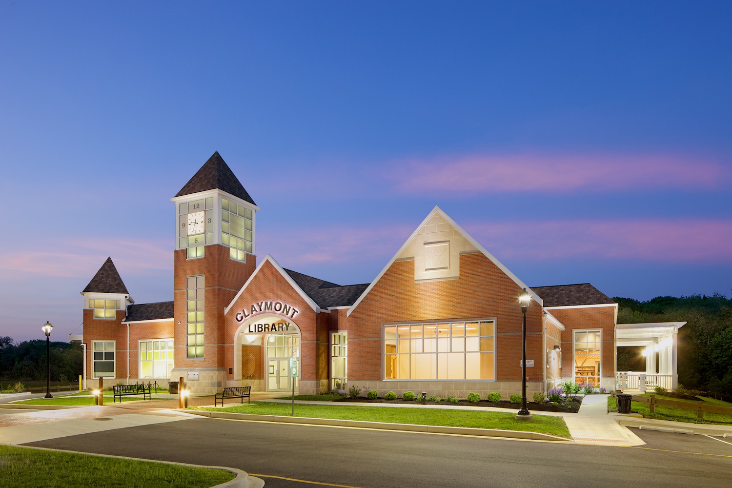
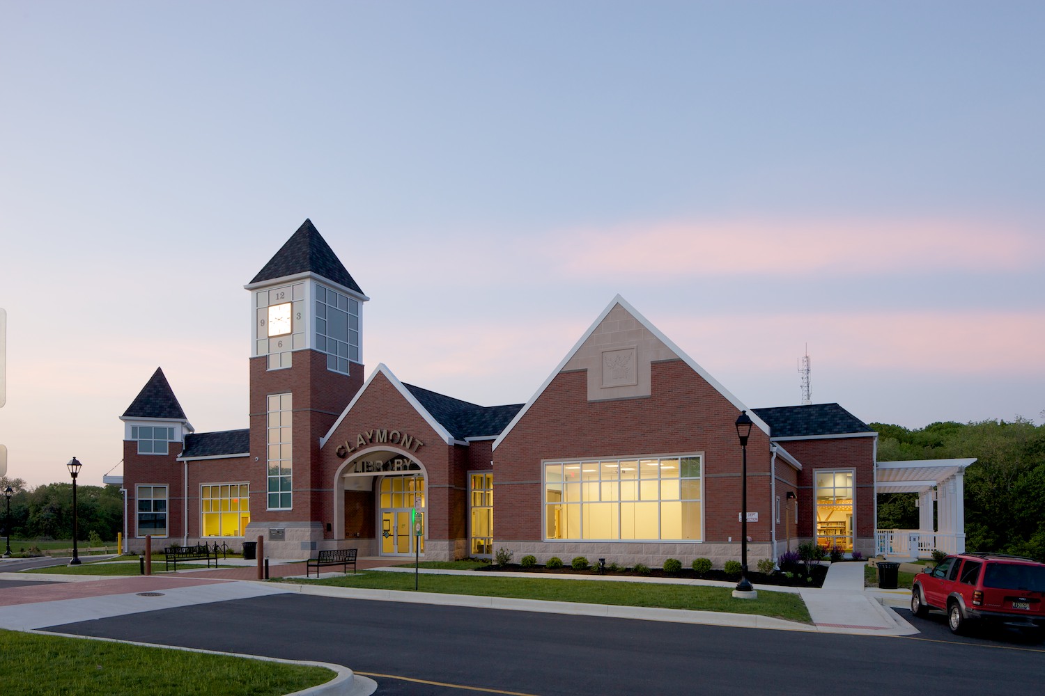
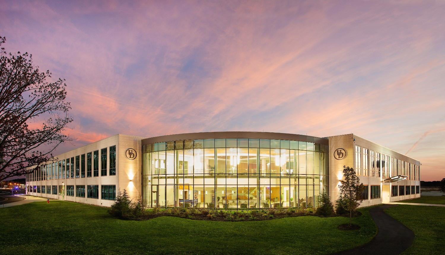
This night shot is another great example of what would be impossible without careful use of lighting and multiple exposures. Since this type of photography is done over stretches of time rather than quick snaps, it leaves all sorts of creative possibilities for the photographer. By using a sturdy tripod and keeping the camera absolutely motionless between exposures, multiple exposures can be combined. It is simple, in this scenario to walk into the shot and light individual elements if necessary. If something doesn't look great in the first shot then it is simply a matter of adding lighting to give it form, contrast and color. In this way the image can be balanced. As you can imagine, it can be a time consuming process but the results are worth the effort. For this image I put together a short video that shows the process of photographing the Claymont library that shows all of the separate exposures that go into making an image. As you can see on the video, not all of the images make it into the final composite image, but having options later when I go to process the final picture insures that I always get the shot. It also allows me to give a range of different options as far as the look of the images I can provide to an architect, builder or designer.
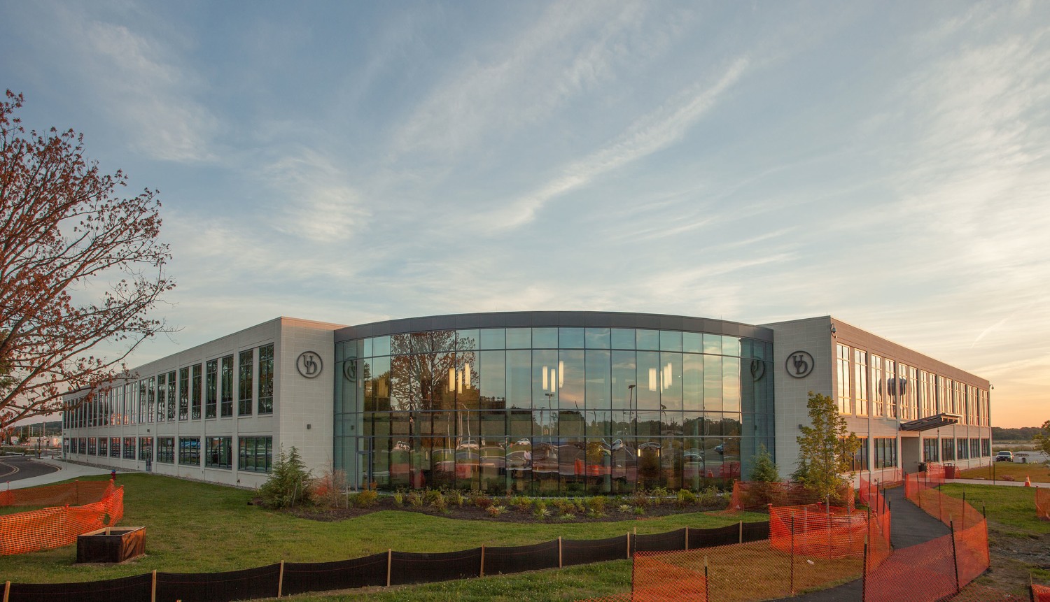
Things on site aren't always perfect or ready to photograph but for practical reasons the client needs the photo immediately. On this job a new phase of construction was beginning and we got the call a little too late to avoid some of the construction mess that had started to gather. So, it was inevitable that we were going to need to do some retouching. Knowing that this was the case, allowed us to prepare. Where we could, my assistant and I pulled down the orange netting and cleaned up the site. I also opted for a higher camera angle of about 9 to 10 feet to minimize the overlap of the dark construction netting and the flowerbed that was a problem from a lower angle. For this image I combined several exposures. One to capture the sky at just the right moment and others to balance the building's interior lighting and the exterior. I have always called this type of shot a twilight, but I recently heard it called a Jack-o-lantern shot and I think I prefer that. Once everything was photographed, the building looked great but something needed to be done with all of that construction debris that was covering the grass and sidewalks. In this case a well-kept lawn near my studio made a wonderful stand-in. I replaced the lawn in photoshop by pasting a photo of the new lawn into the image. I used some supplementary lighting in the form of two very high powered led flashlights that are perfectly color balanced for accuracy. In the end it was worth it because the client was thrilled with the results and I got to spend a beautiful night beneath the stars.
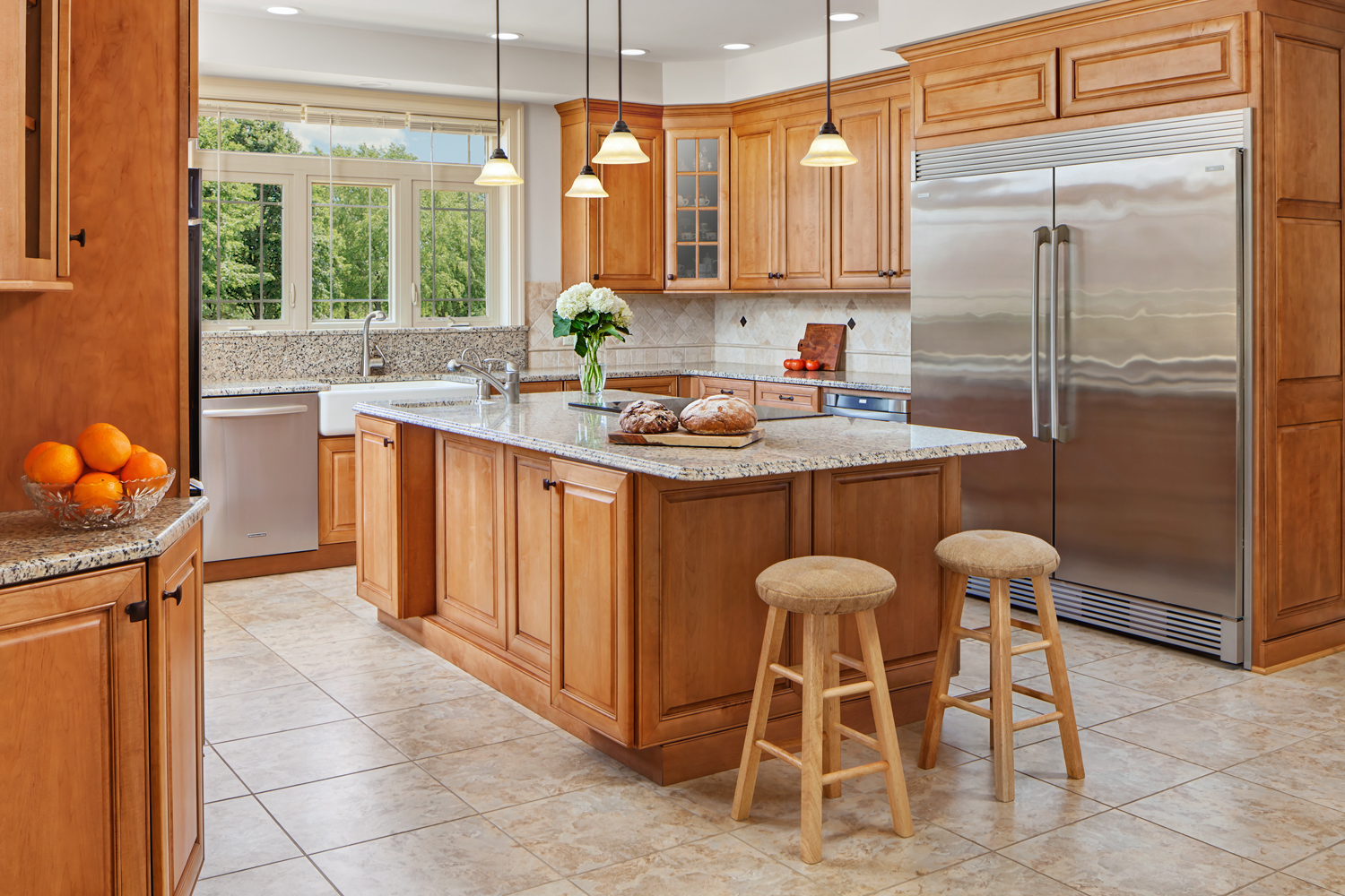
Post-production can be an essential part of my interior design photography. There are several steps in the transformation from the before to the after version. First I shoot without any lighting at all, this is the before version that will get combined with the later lit images. Then next is lighting, either flash or continuous lighting to give shape and dimension. Photographing a room is very similar to taking a picture of a face, if the lighting is too bright or close or harsh or the direction of the light is off, then the portrait won't be flattering. These are all important considerations when lighting still objects as well. Proper lighting minimizes or exaggerates features, it can enhance or negate depending on what you want to accomplish. After the image is shot it is then processed in a RAW converter program to brings out the full range of tones that modern camera sensors can produce. This step is key in nudging the exposure one way or another without adding artifacts like noise into the pictures. Then all of the images that will be used are exported to photoshop where they are stacked and combined using masks much like special effects film masks that were used before the digital revolution. Once everything has been combined into a believable composite retouching brings out the texture and punches up the color and contrast. At this stage unnecessary details like smoke detectors or parking signs can be removed as well. Then hopefully, after all that you have a great looking image. It might sound technical and complicated but it is also a heck of a lot of fun.
For more behind the scenes information and to see current projects and news please stop by my blog and take a look.

