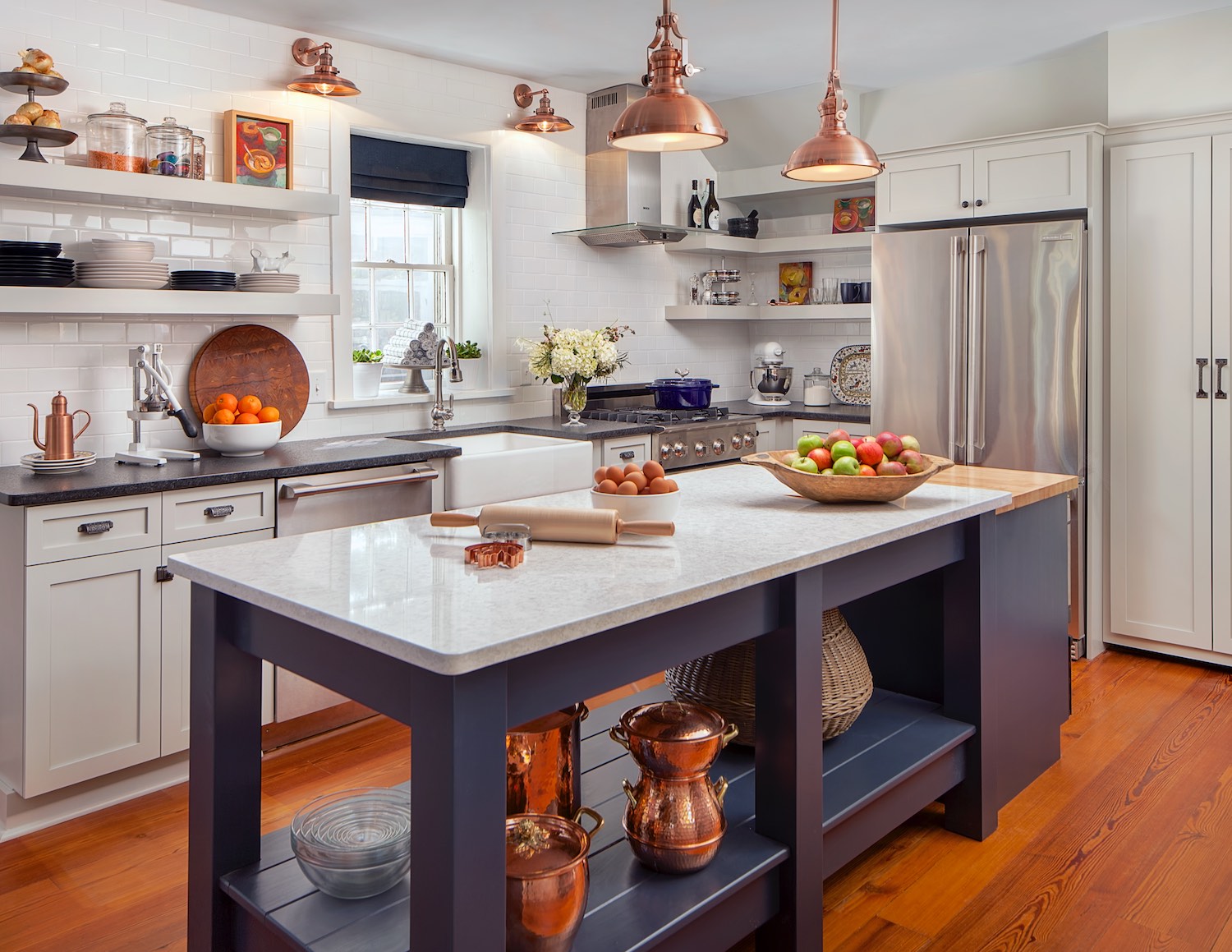
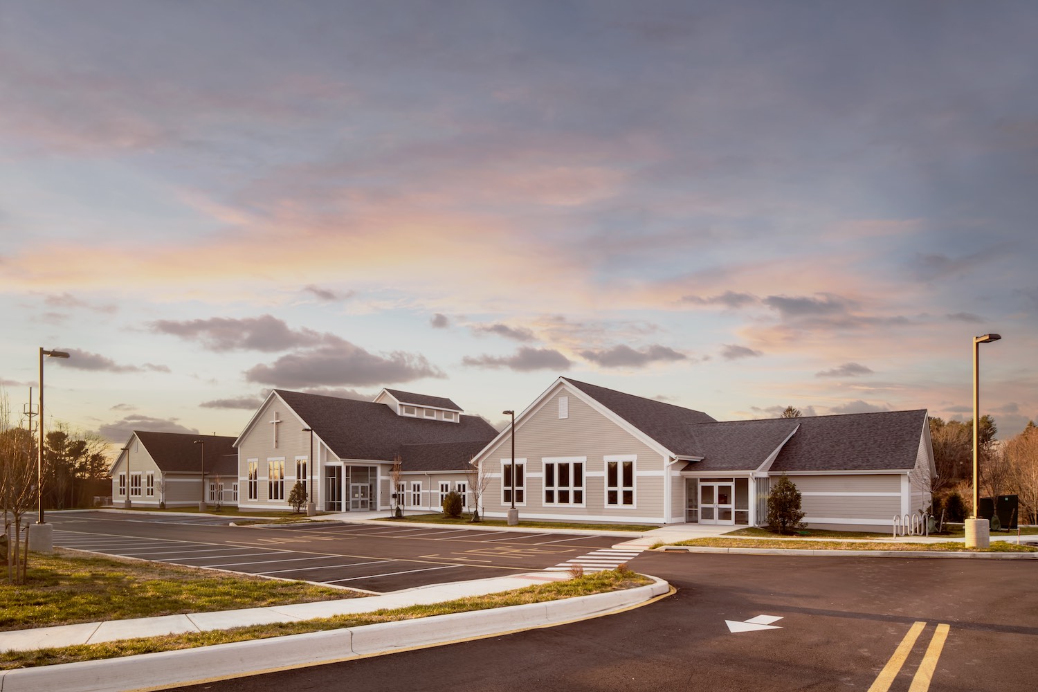
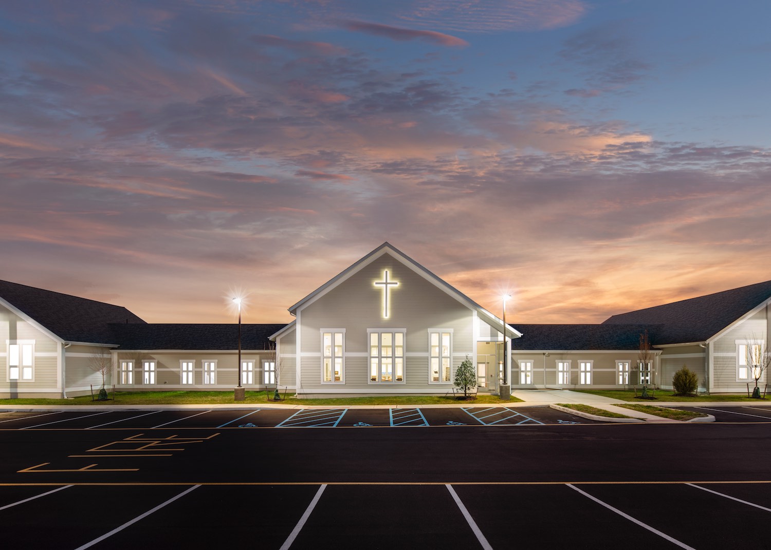
What seems like a good deal might not always be. There are various ways to skin a cat as the saying goes. And, there are various way of photographing architecture as well. I tend to think of the two prominent methods as architectural photography and real estate photography. If you are looking to hire a photographer to document your project or building it can be important to know the difference between the two.
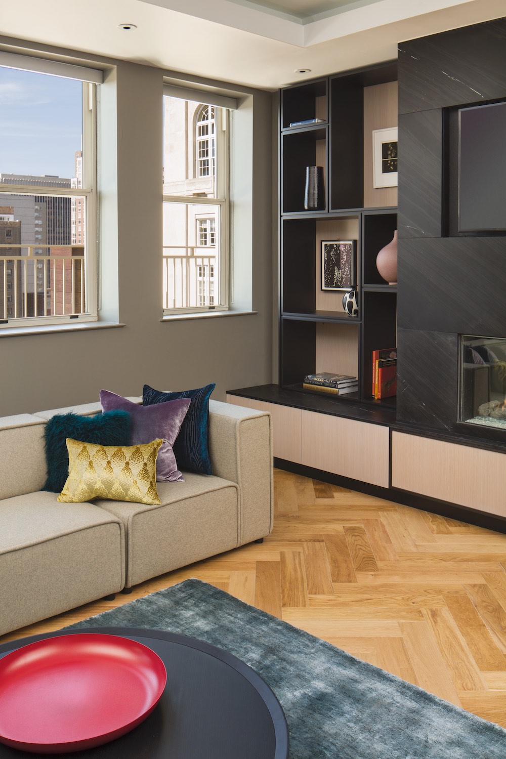
I fall into the architectural photography camp for a number of reasons. The first and probably most important distinction is that it takes an architectural photographer longer to do their job. This is because in photography, with the exception of an occasional lucky shot, the final image is a result of effort behind the scenes. The architectural photographer has to be very thorough, they might take an image, study it, figure out a handful of ways to improve it, like fine adjustments in camera placement, moving furniture, fluffing pillows, organizing and minimizing items in the picture all to get the best image possible. Secondly, the equipment an architectural photographer uses is more complicated. Architectural photographers use special lenses to correct perspective and maximize the image quality possible with modern cameras. Architectural photographers might also work tethered to a computer so they can see the image they are working on in fine detail to be sure everything is in its place. Lastly an architectural photographer is equipped to get the shot no matter what, if the lighting is unflattering they are able to use supplementary lighting that they bring to the shoot to match the interior and exterior light, minimizing haze, glare and color balance issues with mixed light. All of these things take time, but ultimately show in the quality of the final image. All of this effort means the pricing is higher for architectural photography than real estate photography, but since there are more parties interested in the photos there are useful ways to save money when hiring an architectural photographer.
The equipment that the architectural photographer brings to a shoot usually comes on a rolling cart because there is so much of it, it includes back up cameras, a computer, an assortment of lenses, lighting, stands, umbrellas, tripods and diffusion. The reason architectural photographers go to such great lengths is because it matters to their clients, they demand it. An architect can spend years on a project and the photos are often the most prominent way they promote their efforts to future clients. If they are going to the trouble to arrange a photo shoot they want it done perfectly.
The real estate photographer is also very skilled, but the market for each type of photographer is very different. The typical client for a real estate photographer is a realtor. The realtor pays for the photography out of their pocket without knowing if they will be reimbursed with a sale. So, from the realtors perspective, the cheaper the better. If the real estate photos work well and the property sells quickly, the images might be only used for a few weeks rather than 10 or more years that the architect will keep a project in their portfolio. So the images have limited usefulness. This keeps prices low, the images need to be just good enough to get the job done and not break the bank. This means that real estate photographers need to be very efficient to make a profit. They don’t have time to nit-pick every detail, they need to spend a few minutes per shot and move on to the next. They usually don’t use special lenses or work tethered to a computer, there isn’t time. They also don't have time to move furniture, straighten up shelves, make sure there aren’t glare problems, fix overly bright windows or color casts. They can get amazing results, but there is no substitute for the huge amount of effort that goes into producing an image for an architect, interior designer or advertising. To see the different techniques and their results, look at this comparison of lighting interiors vs. exposure fusion.
The equipment required by a real estate photographer usually fits into a shoulder bag with the exception of a tripod. There might be some exceptions but it would be rare to see a real estate photographer with a large rolling cart full of equipment. There just isn’t time to use it on a regular shoot.
Real estate photographers get to travel light, a duffel or backpack and a tripod. Here is my assist Don with the gear we needed for a simple architectural shoot. We normally need a bit more, I can see just by looking at the cart that we didn't have reflectors and skrims (large sheets of light diffusion material), maybe I am carrying them here.
When I photograph architecture I can complete somewhere between 10 - 15 different set-ups in a good long day. A real estate photographer might shoot 50 or more in the same time (conservatively). Occasionally clients will come to me looking for something more in line with real estate photography and I caution them to consider that it might seem cheaper but isn’t. And here’s why. If the real estate photographer shoots 50 images and you post all of the images to your website, realistically, no one will look at them all. People don’t have patience for that anymore. It is likely that your clients will bore after 10 images or so and go on to the next project. The 50 images from a real estate photographer may have been cheaper but when a full 10 hour day of shooting is split by 50 images, each image takes 12 minutes to make. Now, If your client looks at 10 images they are only seeing 120 minutes of effort in total. You may have paid for the whole day but only part of your money is on display. No amount of skill or crazy luck can even the scales with all 10 hours of shooting time visible in the architectural photographers work. Every cent you spend is visible in your portfolio rather than wasted on images no-one will see. It may seem smart to spend a little less less and have more photos, but as I have explained it can also be a terribly inefficient way to allocate your funds when it is essential that your work stands out from your competition.
One final note, this is not meant to belittle real estate photography. The two styles of shooting are quite different. There are some amazing photographers doing real estate. The point I am trying to make is how each specialty is shaped by their client’s needs and each is appropriate for it’s intended use.
As always, please let me know if you have questions or comments. If you are an architect, engineer, builder or developer and you need great photography to promote your business, I would love to hear from you. I am based in Delaware but work in Philadelphia, Pennsylvania, Maryland, New Jersey and all over the Mid-Atlantic. Contact me for a free quote, or stop by my portfolio of architectural photography and take a look. Or if you need help finding the right architectural photographer for you, take a look at this recent post on how to find great architectural photography for tips on spotting top quality work.

