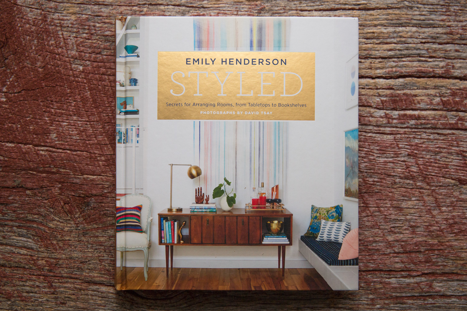
To launch my new resolution of reviewing design books for the blog, I thought I would pick a recent favorite, Styled by Emily Henderson. The book covers making small changes to a room for the biggest impact, and it really focuses on the subject from a interior photo stylist’s perspective. The reason I am so fond of this book is that it fills a niche that very few design books do. Practical advice. Many design books showcase great design but are very light on the substance, especially if you are looking for real world techniques that you can apply today. I don’t know how many books I have that say things like ”pay special attention to color” or “texture can really enhance a design”. Styled is great because it gives me techniques I can use right away. For example the book goes through how to compose vignettes by breaking down the component parts and suggesting types of pairings that work well together. It states what colors work together, what shapes and textures.
Mmmmm, specifics. I love it!
The book quickly goes through various types and eras of design and tries to help you discover exactly what your individual style is. As varied as the design within is there is anunderlying style that I really respond to. It is quirky and creative and tends towards displaying personality rather than austerity. Tending towards quirkier elements like cool paintings and flea market finds, so I get a charge from the rooms in the book.
The photographer side of me loves to look at how everything is composed and photographed and this book doesn’t disappoint. The photography is very bright and punchy and reads very naturally, although I suspect some lighting was used. There is a tendency throughout towards everything being bright and easy to discern rather than moodier and darker but it is a perfect fit for the designers style. As always I wish there were a few behind the scenes shots of the photography. I always love to see images of the photographer at work, if I am lucky it helps me reverse engineer how the shots were put together, and maybe try out a few new techniques or ideas on my next interior design photography shoot.
Inspiring photography, and tons of good ideas.
One of the primary reasons that I started reading so many design books was to improve my styling, and figure out ways that I could nudge a design a bit for the camera. Most interior designers I work with have this covered in spades, but it never hurts to have another sympathetic pair of eyes on set. I have found that keeping up helps me speak the same language as the designer. Even when I shoot architectural photography where I typically work alone, all of the principles still hold true. Now I know that if I am going to move a plant in the shot, I have a good idea exactly where it should go and what it should accomplish. It might add height to draw the eye or break an otherwise harsh horizontal line it might give softness to an overly boxy or square grouping.
Photos and descriptions that walk you through the concepts rather than inspirational quotes, what a concept.
This book would be good for anyone looking to understand and start styling at all. The techniques apply no matter what project you are working on and there is enough meat here for the the whole design let alone for photo styling. It is refreshing to have a book in my library that is focused on styling for photography because there are so few of them. I have at least one other that is long since out of print but still a gem because the information is so perfectly directed towards what I am looking to accomplish.
Thanks for reading. Let me know if there are any other photo styling books or resources that you know about, I would love to read more on the subject. And if you are an interior designer or decorator that needs great interior photography to promote your latest project contact me for a free quote, I work throughout the mid-atlantic, Delaware, Maryland, New Jersey, Philadelphia, Pennsylvania you name it. If you would like to see some examples of my interior design photography visit www.danieljacksonphoto.com.


