• Gallery 1
  • Gallery 2
  • About
  • Blog
  • Contact
Menu

Daniel Jackson Architectural Photographer

Architectural Photographer
  • Gallery 1
  • Gallery 2
  • About
  • Blog
  • Contact
×

The amenities space in the beautiful Edgewater in Philadelphia. One of a group of images I made of this project

Group Photos

Daniel Jackson April 2, 2025

Architectural photography is all about providing good consistent results. Here are multiple views of a project to give an idea of what a whole shoot looks like.

Read More
Comment
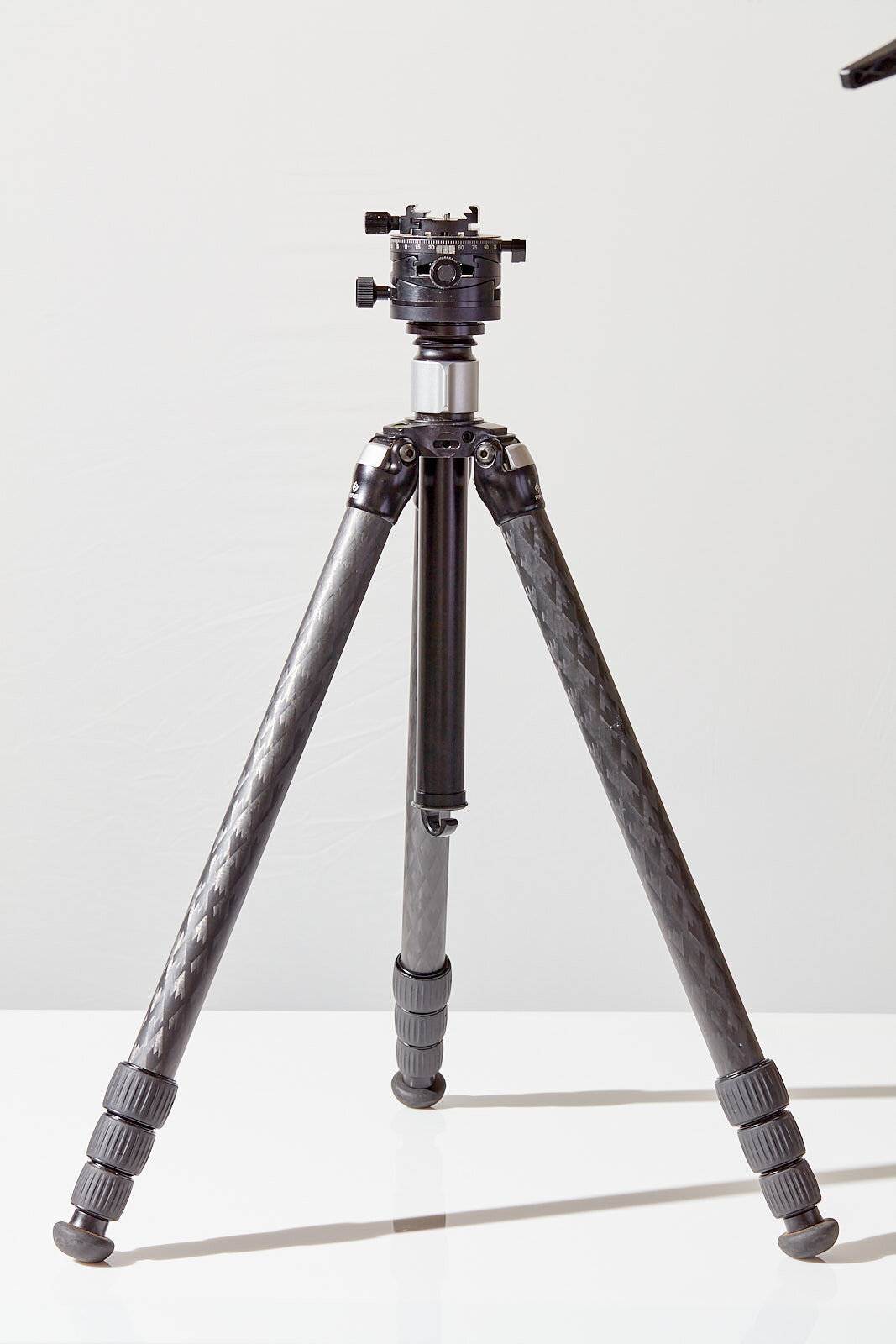
The Really Right Stuff TVC 24l

The Really Right Stuff TVC 24l

My Really Right Stuff TVC 24L Review

Daniel Jackson October 17, 2021

After a couple years of using my Really Right Stuff TVC 24l while photographing architecture, I think I am ready to say how this tripod has changed my life for the better or worse.


First, for the uninitiated that don’t know anything about RRS tripods, the names of the tripods describe the features. So for 24l, the 2 is for the series, the 4 is for how many sections and l is for long, which means it is extra tall. My tripod, the series 2, is on the smaller and lighter side of RSS’s offerings. There are 4 series in all, 1 being the lightest and 4 being the heaviest. 4 sections, simply means that there are 4 extendable leg sections. Then the TVC stands for the Versa (versatile) collar, which is slightly larger than the q designation and allows the use of a center column if you choose.


Like many architectural photographers, I came from the school of, “the heavier the tripod the better”. There are lots of reasons to have a heavy tripod, after all, a heavy tripod stays still, it is solid, holds plenty of weight and doesn’t budge in windy conditions. With a smaller tripod I can always bring along a sandbag, but with a nice sturdy tripod I am going to have a rock solid platform no matter what. But the extra weight is getting old, especially when I am doing a lot of moving around in a larger building. The weight focuses in my shoulder and the small of my back and I feel it for the next couple of days after a big shoot.


Super solid, uncompromising quality in all of the fittings.

Super solid, uncompromising quality in all of the fittings.

Considering its size and my aching back I have been looking at my Manfrotto 057 with geared column in a different light. I love the 057 and when weight isn’t an issue it is still a wonderful tripod. But that is slowly changing. I have found that the circumstances that necessitate a heavy tripod don’t really come up as often as I thought. Plus, every time I lift up my RRS I am pleasantly surprised by how light the whole rig is.


It has taken a little while to get used to the collar style leg locks, rather than the levers that the Manfrotto uses. I find the levers to be super easy to use, I can’t even imagine how to misuse them, flip it open move the leg and flip it closed to lock it in place. In the RSS I find that I will turn to lock the leg in place and realize that I am loosening the leg. It only takes a second to correct the problem, but I seem to do it a lot. I don’t miss the geared column on my Manfrotto quite as much as I thought I would as well. In shooting architecture, the fine control of a geared column is wasted, probably a much different story for macro work though.


The fit and finish of the RRS are exceptional, all of the metal parts are very well machined, the tripod is nice and tight. The fit of the pieces is great, movements are smooth. It absolutely feels better constructed than cheaper tripods, including my beloved Manfrotto. 


Leg collars, convenient but slightly confusing from time to time.

Leg collars, convenient but slightly confusing from time to time.

The obvious question is, is it worth the extra cost. After all, RSS is among the pricier tripod manufacturers out there. Since it is literally possible to buy 3 or 4 tripods rather than one RRS, why would someone spend so much? Well, I think makes sense In a professional environment, where it is essential that the gear has to be absolutely reliable. While a cheap tripod might work in most situations, there is the slight chance that it will break on an important job and then you will wish you had spent a bit more.


Another consideration is that a higher-end tripod like an RSS will always have plenty of interest in the used market. If you buy a brand that you don’t recognize, you run the risk that the item has no value whatsoever in resale. RSS is a respected brand with waiting lists for many of its products. If you purchase a tripod and have second thoughts even years later the tripod will have close to it’s original value. Let say you buy a tripod, keep it for 3 years and sell it at a $100. loss. You paid $30. a year for an excellent tripod. If you pay $300. for a lesser tripod that breaks in 6 years, you paid $50. a year for a tripod that was a pain to use. I know there is some funky math here, but you get the point.


Top of center column comes off and attaches tightly to the tripod head, can be a nightmare to remove.

Top of center column comes off and attaches tightly to the tripod head, can be a nightmare to remove.

So, whats the verdict? The TVC 24L has been an absolute pleasure to use. Dropping a few pounds from my rig makes all the difference. It is much smaller and easier to carry. The height is good, with my camera mounted it is over my head. When fully extended the tripod starts to feel a little flimsy. The 24L is so light that a little tap can move the tripod. Any movement at all can be a pain when working with compositing, but is the tradeoff expected from a smaller lighter tripod. My Manfrotto was a little more forgiving of bumps and stayed solid even fully extended, but was also killing my back. I have had the 24L for a couple of months and so far it has been on every shoot and I haven’t run into anything it hasn’t done well.

Comment
a quick shot from my iPhone helps me remember where everything so I can return it to its original condition.

a quick shot from my iPhone helps me remember where everything so I can return it to its original condition.

A Little Look Behind The Scenes Of An Architectural Photo Shoot

Daniel Jackson August 27, 2019

While getting the best angle and the right lighting is crucial, it isn’t the only thing that goes into a a good interior photo. Sometimes you need to get in there and move some stuff around. The room might look amazing as you walk through it, however once a composition is chosen and the camera is in place the photos just don’t look right.

The solution to a funky photo might be to consider moving some furniture, thinning it out, scooting it around, whatever it takes to make everything look its best. Overcrowding can be a big problem, so an adjustment here and there can inject some needed breathing room, on occasion when things look really tight a table and set of chairs might be moved out of frame. More often though as the room gets distorted by the lens, the closer objects and those near the edge of the image can start to look strange so a little adjustment can put things back to looking normal, even when they look bizarre to your eye.

Thats more like it, all of that confusing stuff to the right of the window didn’t help show off the room’s function, it just confused things. now the room feels balanced, and the viewers eye can roam around the space freely.

Thats more like it, all of that confusing stuff to the right of the window didn’t help show off the room’s function, it just confused things. now the room feels balanced, and the viewers eye can roam around the space freely.

This classroom is a great example, it is in pristine condition because it was just finished, the furniture was moved in , everything is inviting and functional and it will surely be an exciting space for the new students returning from vacation and about to start the new year. At first look from my iPhone, everything looks fine, so I start to pick out details I think I might like to improve upon.

Things feel a little messy and crowded. I would love to see more of the reading area in back, the rug looks comfortable but is barely visible, so it would be nice to see that too, it will also be a nice pop of color. There are two desks facing each other, removing one would free up some space. There are shelves and play areas that also provide a little visual clutter so we pull those out and color coordinate what we keep. The chairs come toward camera to give the room a distinct seperation between the work and play areas. Once the tables are lined up and the chairs carefully placed, they are moved around the picture plane to make an interesting composition.

As my assistant and I work we peek into surrounding rooms for inspiration, we find some stuffed animals for the white shelves in the reading nook, a globe for the desk and a cute desk and building blocks for a little color and detail in the front of the shot. Every chair is straightened to make things nice and orderly. Once everything looks great we photograph the room in several exposures, some with the lights on, some with the lights off and some with powerful studio flash units. Later the exposures will be combined to create a natural looking image that shows the whole range of colors and textures that are there in the space.

After we have photographed the room, one of the most important steps is to return everything back to its place, so no-one can tell we were there.

Once things are nice and organized, I get another shot to show the built-in cubbies and cabinets.

Once things are nice and organized, I get another shot to show the built-in cubbies and cabinets.

4 Comments
This simple shot required a few props to get the job done, I had them on hand so they cost nothing but what if the client needed something different, that might require a special shopping trip.

This simple shot required a few props to get the job done, I had them on hand so they cost nothing but what if the client needed something different, that might require a special shopping trip.

What does a photograph cost?

Daniel Jackson May 27, 2019

Seems like an easy question, but I am constantly frustrated by pricing job’s as a commercial photographer. I would love it if I had an easy answer when people asked for my rates. After all, I can go into the grocery store and pick an apple, and the price is a relatively simple $1.00 or something similar, easy peasy. The store has costs like transportation, spoilage, rent, air conditioning and a billion other little costs but somehow they figure out that to make a profit they need $1.00 per apple.


The photographers job is much more difficult. Lets say a client wants to know how much it would cost for a photograph of an apple. The client would love to know right away without a whole lot of back and forth discussion. And to make things worse, If you take too long and ask too many questions, you may very well scare off your potential client. But, “how much for a photo of an apple”, can be a really complicated question because there are so many ways to well, photograph an apple.


Now for you non-photographers, you are probably thinking, "big deal, it is a photo of an apple, charge $10. and move on with your life."  And yes, It probably seems a little ridiculous to worry about the price of an apple photograph for more than a millisecond, but that is precisely what photographers have to do, and if they don't learn how to imagine every scenario it will be at their own peril.


When I consider this question for a moment I begin to ask questions that if overlooked could make or break the profitability of a project. I would start by asking my apple client if I will be provided with apples, if not, I can imagine a bunch of possible issues. Does the photo need to be of a particular variety of apple? Can I source the apples locally? If not, can I get fresh apples with the leaves still intact? How long do the leaves stay intact after all? Is the variety of apple in season right now. obviously if getting the proper apple for the shoot is a problem then time, research and money need to go into getting the perfect apple overnighted to the set.

Is the variety important, can I get them this time of year and with the leaves attached? You need to consider your clients needs and figure out how to give them what they need.

Is the variety important, can I get them this time of year and with the leaves attached? You need to consider your clients needs and figure out how to give them what they need.


Speaking of sets, client's needs can be very specific. Does the apple need to be on a white backdrop, or spilling out of an orchard basket? Should it be sitting on a kitchen table or a tree stump? If it is a kitchen table, is there other food involved? and if so, how complicated is the preparation and how perfect does it need to look? Will a food stylist be necessary? The point of all of this is that every decision requires someones attention, if the backdrop needs to be a marble slab or an antique cutting board someone needs to shop for options, buy them and get them on set. You can begin to see how a photo of an apple can be a little more complicated that a click of the camera shutter. And if you quickly were to answer $10. you as the photographer just promised the client something you can’t deliver without losing hundreds of dollars out of your own pocket.


Let's imagine a couple of different scenarios from the same client. The client is a local orchard that allows patrons to "pick their own", they also sell jams and jellies and even offer hayrides. They are interested in two bids, a low cost option and a more expensive image that could tie in all of the aspects of the business. The intended use for both images will be a webpage banner as well as local advertising and direct mail. 


The idea for the low cost version is a single retouched image of a perfect apple being plucked by a childs hand. The orchard will provide the location and all of the apples, and two of the orchard's employees have volunteered their children to model for the hand. This shot is relatively simple, made even easier by the volunteer hand models. The shoot would take a couple hours and would probably require an assistant to hold a reflector to get the best possible light. The assistant also keeps the pace moving quickly which can be a life saver when kids are involved.


so the costs of the first scenario would be:


1. The photographer’s time on set

2. The assistant’s time on set

3. Post-processing of the images

4.  Use of the photographers equipment- in this case a camera, lens and backup camera


The more expensive option features an antique basket stuffed to the brim with perfect apples and their signature brand of jams and jellies, wrapped in a gingham cloth, while in the background the hayride passes a family happily "picking their own". This shoot poses several challenges that each require time and resources. For instance, the antique basket, if the client doesn't have one or for some reason wont work because it is too big or small. One needs to be found or purchased. Sourcing a good selection of baskets will take a couple of hours of ebay shopping and a few purchases totalling somewhere north of $150. Then the basket must be filled in an appealing way, it might require a false bottom, or perhaps the apples and jars will need to be glued into place with hot glue or dental wax to get every jar's label legible and looking good. All of this matters and requires time and attention on set. 


Since this will essentially be a product shot, lighting will be necessary for the foreground element of the basket of apples and jellies. The background plates of both the hayride and the family picking apples can probably safely be shot using natural light. Each element requires special attention so the final image will likely be composed of several exposures combined together digitally by a retoucher. In order to insure that the shoot is a success, the images will be captured direct to a computer so that the client can watch and provide imput.


The costs for scenario two include:


1. The photographers time on set

2. The assistants time on set

3. Time purchasing and shopping for props (basket options and gingham cloth)

4. Time coordinating family shoot

5. Time styling basket and props

6. Expendables , gells for lights, gaff tape, cinefoil, glue or dental wax

7.  Actual costs of props

8. post-production of images

9. The retouchers time piecing together best versions of photos

10. Use of photographers equipment which in this case includes a camera, lens, backup camera, battery powered strobe lights, computer, equipment cart and a tethering table for computer monitor. 

It is easy to see how even two images for the same client can require drastically different effort and time. While 10 bucks might be plenty to just “photograph an apple”, it won’t cut it for anything remotely difficult. The more complicated and specific the clients needs are, the more challenging bringing all of the parts together can be. Since it only takes a fraction of a second to shoot a single photo, it is easy to forget that it can take a co-ordinated effort and days of preparation to make something really great. And it all goes to prove that an apple is not an apple is not an apple.

Daniel-jackson-commercial-photography-food-02.jpg


1 Comment
Here is the cover, my part starts on page 60

Here is the cover, my part starts on page 60

Eos Photo Magazine Article

Daniel Jackson November 3, 2018

If you are as big a fan of Canon cameras and lenses as I am you might want to check out the current issue of Eos Magazine on newsstands now, or pick up a digital subscription. There is an article on the new Canon Tilt-Shift lens 90mm 2.8l that was written and photographed by a commercial photographer named Daniel Jackson. Yes, the same Daniel Jackson.


One of the best parts of being a photographer is the tools. It can be a blast to try out a new lens and see how its features might allow new creative possibilities. I recently picked up a new Canon 90mm tse 2.8l Tilt-Shift to use while shooting product photography and have begun putting the lens through its paces. I even did a blog post comparing the new 90mm tse vs. the older 90mm right here.

Fun to see a full page bleed of one of my shots

Fun to see a full page bleed of one of my shots


Tilt-shift lenses are an important part of the work I do, whether it is for architectural photography or product and food. I find it invaluable to have the ability to control perspective that no other type of lens can manage. With my devoted affection to tilt-shift lenses I was a perfect candidate to demonstrate how this special kind of lens might help other photographers with their work.

another page, there is more, but you will have to buy a copy to see the rest.

another page, there is more, but you will have to buy a copy to see the rest.


If you are all curious about tilt shift lenses, check out the article or pop over to my blog post for a condensed version and a comparison between the two Canon 90mm tilt-shifts

1 Comment
Philadelphia-cookbook-photographer-Daniel-Jackson-04.jpg

Marketing With Photos 101 (Can't Afford Photography? You are probably doing it wrong.)

Daniel Jackson August 27, 2018

So, you are at the point where you have decided that you need quality photography to promote your business. You may even have gone so far as asking for prices, only to find that everything is a lot more expensive than you had expected. And while it might certainly be the impression at first glance that photography is out of reach. The real issue is that most businesses don't understand exactly how to exploit their purchase to the fullest.


One of my specialties is architectural photography, so I do a lot of work with architects and interior designers. Of whom, many are with small firms or one-person business that don't have much experience with marketing yet. So when the conversation gets to pricing they are essentially going from a budget of $0. for photography, to what must seem like prices through the stratosphere. The problem is that they see photography as an all or nothing proposition. They think" if I switch to a professional photographer for my portfolio then I will have to pay "all this money" for every project, without really knowing the benefit of the new expenditure. This is where things go wrong, because rather than being boxed into a corner at this point, in reality you have lots of options at many price points.

Time to break things down.

You don't need to jump right into the big leagues. If you can be strategic about how you use a single image or a small handful of images, a few hundred dollars can make a big impact on how your business will be seen in your market. 


Philadelphia-cookbook-photographer-Daniel-Jackson-02.jpg

Lets say you have an interior design business and that much of your business is local. Hopefully, word of mouth has served you well, you might have met a client while networking, handed out a card or had a friend of a friend recommend you. If you are lucky and they remember you, they will come looking for you. And since it isn't the 90's anymore when they look for you it is not going to be through the Yellow Pages. They are going to Google you, and if they don't fully remember your name, they will search for something like "interior designer near me".


The results of your potential client's search will be a mix of all sorts of information. Google will probably suggest businesses near you with a map, there might be some local directories like Manta, Yelp, Google+ and if you are lucky and have a good enough website your webpage will hopefully show up in the first page of results. What you really want is continued engagement, you need for your client to contact you and for you to ultimately make a sale. And if it takes longer than a few seconds for you to make an impression than you are probably in trouble.

Daniel-Jackson-Interior-Design-Photographer-30.jpg


All of the local directories are there for businesses, if you go to their page and claim your business you are allowed to add information like web page, contact phone numbers, email addresses and hours of operation. Going on these sites and claiming your business is a big step in the right direction, it speaks highly of the level of care and service that your business provides. But what I see as one of the most important features is that you can post photos. Photos are a big open window into your business. They are welcoming and assure people of the level of engagement and care this business takes in serving their clients.


A typical search in a local directory provides tons of listings, some businesses have claimed their listings and have a phone number or email that is easy to find. But, very few businesses post photos, especially good ones. They might post some dingy iphone images that should scare anyone in their right mind away. But bright and engaging photos that attract attention are uncommon. One thing that is clear when comparing businesses though, is how much of an impact a great photo or a couple of photos can make. I barely notice the listings without images and unless I am specifically looking for a particular business I will probably be distracted by the most impressive listings.

Daniel-Jackson-Interior-Design-Photographer-902.jpg


Imagine this scenario, your client has heard great things about your work and is ready to hire you. They look up your name in Google but also find some great looking images in the exact style they had in mind by a designer a mile away. The images popped right up in the map results because that designer claimed their listing and posted a few professional images. If your client is considering getting a second bid, they might have just found their designer.

So lets get down to brass tacks.

You really love the work of a photographer, the style fits with your brand and the pictures look like they are out of a magazine. The photographer quotes you $250. per image for unlimited use online, you decide to get two, even though it seems expensive. One picture of your interior design and a great head shot. Most people stop there and don't really use the pictures. They might post to facebook or istagram and think the money was wasted (it probably was).

Here is how you should use the images:

Find your listing in Google maps, claim your business and post the photos

Create a listing on Linked-in and post your headshot and photo

Create a listing in Google+ and post photos

Create a listing in Manta and post photos

Create a Bing business listing and post your photos

On your Facebook business page, update your profile with the headshot and use the       design photo for your banner

For $500. you seriously upgraded your local businesses marketing and boosted the first impression of almost every single person that contacts you. You got some very positive looks from people trying to find your competition. You added a bunch of links to your website and made it much easier to find. Give it a couple months and If you like the results get another two images and slowly build up your assets. You actually have lots of options, and you don't necessarily need to start spending a fortune on photography. You can get a couple of stellar shots and supplement with iphone photos. How you proceed is up to you but if you have been scared off by high prices, you are probably doing it wrong.

Philadelphia-product-photographer-Daniel-Jackson-06.jpg


Comment
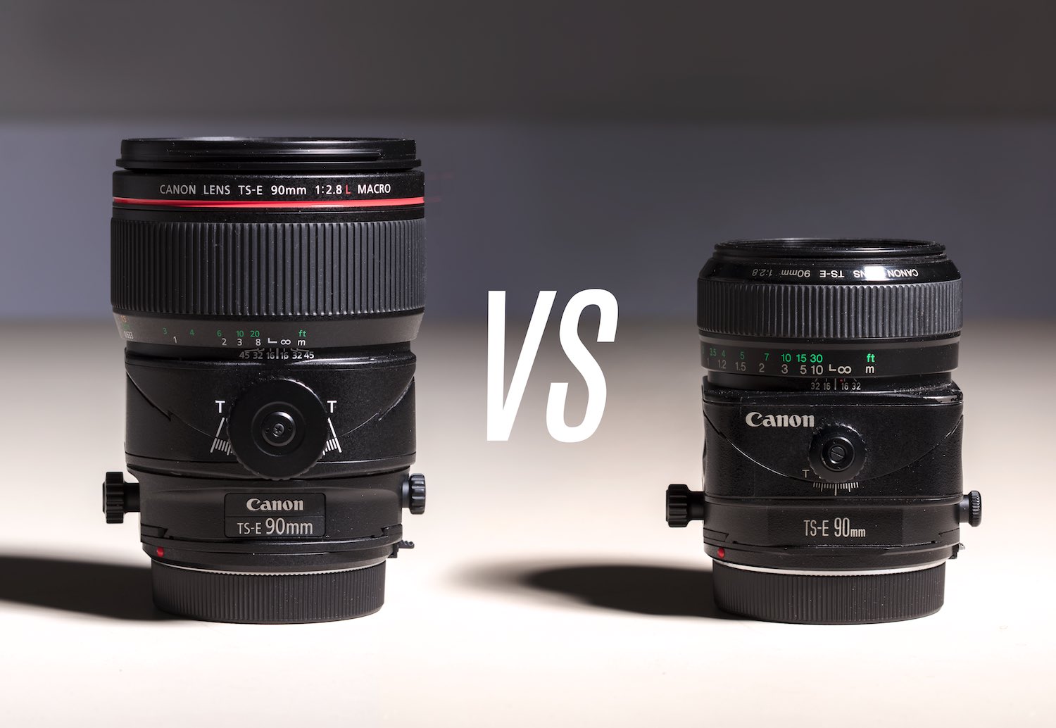
Here they are side by side for scale, the newly released 90mm ts-e macro and the original 90mm ts-e. Ts-e in Canon speak, means tilt-shift.

Here they are side by side for scale, the newly released 90mm ts-e macro and the original 90mm ts-e. Ts-e in Canon speak, means tilt-shift.

The New Canon 90mm 2.8l ts-e Macro Tilt-Shift Lens Vs. the Old 90mm ts-e

Daniel Jackson March 2, 2018

When I heard recently that Canon was upgrading some of their tilt shift-lenses I got very excited. As you will soon learn, I am a bit of a nut for tilt-shift lenses and I wouldn’t want work without them. My 24mm and 17mm get almost constant use for my architectural work, and the 90mm is my lens of choice for food and product. I love the control they give me, and while they lack the convenience of autofocus these lenses cause me to slow down and take my time and hopefully take better pictures . Adding to the list of positives is that fact that some of the recent Canon lens upgrades have been nothing short of miraculous in terms of optical improvement (I’m looking at you 24-70mm 2.8l II). 

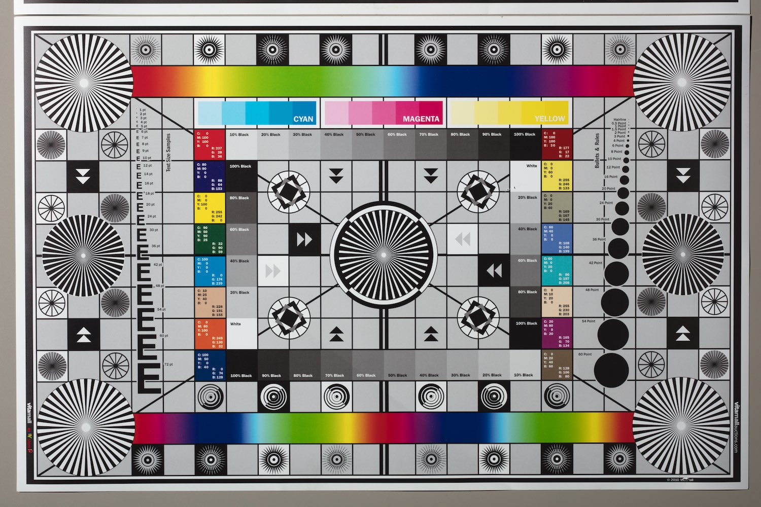
The chart I used, while arguably not the fanciest was helpful for my simple sharpness test.

The chart I used, while arguably not the fanciest was helpful for my simple sharpness test.

The three updates are a 50mm (to replace the 45mm), a 90mm (which updates a classic to a macro L version) and a 130mm. Looking at their charts the optical performance of all three lenses should be nothing short of amazing. I also do a good bit of pixel peeping while researching lenses at “the digital picture” which confirmed my suspicions that the 90mm was super sharp. Similar to my eyes to much more expensive boutique lenses like the Zeiss Otus. As I looked more into the 90mm macro I started to daydream about how I might use all of this resolving power and before you know it I had decided to unload some lesser-used gear and get myself one of these beautiful new tools.

Top right corner zoomed in to over 100%, darned hard to see the difference. f11 at 1/125

Top right corner zoomed in to over 100%, darned hard to see the difference. f11 at 1/125

My first impression of the new 90mm ts-e was very favorable, the lens is much bigger and heavier than the classic with a more solid feel. When compared to the original 90mm ts-e it seems almost twice the size and weight. I don’t much mind the weight because I generally use this type of lens on a tripod. The fit and finish of the new lens is more in keeping with it’s L series counterparts. The focusing is stiff but smooth and reassuring, the feel is quite different than the effortless focusing on the older version. On looks alone this new lens is a knockout. 

Here is the view after shifting the lens, I chose to inspect the top right hand corner to see the performance shifted to the outer limits of the lens.

Here is the view after shifting the lens, I chose to inspect the top right hand corner to see the performance shifted to the outer limits of the lens.

I was already a fan of the original 90mm ts-e, so the opportunity to upgrade to a L lens with better durability, sharper optics and weather sealing was exciting to say the least. Though due to the design quirks of a tilt-shift lens, the weather proofing is not as effective as on a typical L lens. My initial feeling about the lens once I had time to do a little shooting, was that it was the best lens I had ever worked with. But I have learned over the years that it is easy to jump to conclusions that prove to be incorrect. So I decided to test my perception by a simple head-to-head comparison.

Here are the results at a little more than 100%.

Here are the results at a little more than 100%.

I decided to start with a lens calibration chart so I could judge sharpness from the center to the edges. I shot with the camera tethered to a iPad so I could zoom in and get perfect focus. Tethering allowed for triggering without touching the camera and introducing any additional motion or blur. I used strobes for lighting that also have the benefit of further reducing motion blur because of how quickly they make the exposure. Finally, I used mirror lock-up to insure that the  motion of the mirror wouldn’t effect the results. I know that several of these steps are redundant when working with strobes but I wanted to make sure that I got as clean a shot as possible.

Here is some nice crisp text for the next part of my test.

Here is some nice crisp text for the next part of my test.

Once all of the pieces were in place, I made some images of the chart. The aperture was set at f11 which should provide the best sharpness results for both lenses. I shot one image with each lens with the shift centered and another shifted fully in order to test edge to edge sharpness. I pulled up the results in camera raw and was surprised by the results. Rather than the huge jump in quality I had anticipated, I could barely see a difference. The new lens had the edge, but just barely. It was so small a edge that I could barely see a distinction when zoomed in at 100%. Just to be sure, I took the files from both lenses and layered and aligned them in photoshop so I could go quickly back and forth between the files and the result was the same. There was an almost imperceivable difference, with the very slight edge going to the new 90mm ts-e macro.

Here is the jar portion of the image. the older legacy lens on the left and the new macro on the right.

Here is the jar portion of the image. the older legacy lens on the left and the new macro on the right.

Surprised by my results, I decided to expand my test. I found some sharp contrasty lettering on a jar in my studio, I focused and shot with both lenses, stacked and aligned the images and sure enough I got the same outcome. Both lenses were amazingly crisp, but with such similar results, is the upgrade worth it? At this point I had my doubts.

The closest focusing distance of the new macro, the detail is gorgeous, especially when you zoom in to see all of the detail.

The closest focusing distance of the new macro, the detail is gorgeous, especially when you zoom in to see all of the detail.

Macro capability is a feature of the new 90mm to-e l, so I decided to test both lenses at their closest possible focusing distance. Here, the new lens comes out on top. While the lens isn’t technically a 1:1 and therefore not a true macro, it doesn’t disappoint when it comes to close ups. In using the older 90mm ts-e I would commonly hit the close-focusing limit and resort to using an extension tube to approach macro magnification. The newer lens seems to have a nice range, without resorting to extension tubes.

Here is the same subject photographed at minimum focusing distance for the older 90mm ts-e.

Here is the same subject photographed at minimum focusing distance for the older 90mm ts-e.

While there is no appreciable difference in sharpness at f11, at f2.8 the two lenses are quite a bit different, the new 90mm is a lot sharper. As the aperture goes up, the difference between the lenses shrinks to become almost negligible. The important consideration is determining how this type of lens is most likely to be used. For product, I am always shooting at an aperture of f7.1 or higher, at which point there is very little distinction between the lenses. Both lenses do exceedingly good jobs with the precise technical demands of product photography but the newer lens adds the ability to shoot (near) macro. For photographing food, depending on the style it might be more common to shoot at lower apertures where the extra sharpness of the new lens might be beneficial, however for the more editorial style of shooting food the original lens is plenty sharp and makes files big enough for almost any use. It really seems like the only place in food photography where upgrading to the new lens might be necessary is to capture highly technical commercial work for packaging or advertising.

I absolutely love both lenses, but the macro is a welcome addition.

I absolutely love both lenses, but the macro is a welcome addition.

While the new 90mm ts-e macro is a engineering marvel, testing both lenses side-by-side really convinced me how great a deal the legacy 90mm lens is. Some older lenses haven’t kept up with the resolution needs of the higher megapixel cameras of the last few years, but that isn’t true of the original 90mm to-e. The excitement around Canon’s new line-up has drawn attention away from a real gem. Used versions are selling on EBay  at sub $600., even though the image quality easily  rivals its far more expensive successor. All this is not to say that the new 90mm ts-e is not worth the money but that upgrading is far from the obvious choice that it seemed.


4 Comments
A french flag, positioned near the lens. A flag can be a great way to reduce lens flares.

A french flag, positioned near the lens. A flag can be a great way to reduce lens flares.

Architectural Exterior Photos - and how to fix them when they go wrong

Daniel Jackson February 25, 2018

Like every photographer, I make mistakes while shooting.  As soon as I start thinking this is going to be easy, I figure out some way to mess things up. I have grown to see mistakes as a crucial part of becoming a better photographer. Because each monumental mess-up gets etched permanently into my brain. So I have compiled a list of pretty much everything I have had go wrong with an exterior shoot, and how I fix each issue.

A major problem is the feeing that the next shot will be a piece of cake. I start wondering if I should bother tethering. Or, if I can barely see the on camera screen, no big deal, I am pretty sure it will turn out. I might be exhausted after lugging my tripod, camera and lights around all day and start to cut corners. This is easily my biggest problem, and the lessons here is  is to slow down and take my time and do every task as methodically and precise as I have time to do.

Exterior architectural photography usually starts days before the actual shoot. Typically to schedule the best time to get the shots you need. In a perfect daytime photo, I want to see some bright light scraping its way across some of the textures, I want minimal shadows but some directional shaping of the light. And, if shadows are an issue, I want them to fall in an interesting or appealing way. Since I wont be able to do much lighting to buildings during the daytime (nothing is powerful enough), my only choice is to shoot at the best time for good light and good weather.

Compendium lens hood and adapter rings. Another approach to getting rid of lens flare.

Compendium lens hood and adapter rings. Another approach to getting rid of lens flare.

I usually watch the weather online and schedule on days that won’t be completely awful. Then I use an phone app like Sun-Seeker that allows me to look at satellite images of the site I will be photographing and track the sun’s movement for the day I have scheduled. Keeping in mind that at noon the sun is overhead which can be problematic if the buildings have awnings. Sometimes because of mid-day shadows I will just skip from about 10:30am to 1:30 or 2:00pm just to insure I get better light. Usually the building will get good light at a particular spot either in the morning or afternoon but rarely both. So I take my shot list and schedule exactly when each exterior needs to be taken.

Here is the hood attached and closed.

Here is the hood attached and closed.

so this brings us to the day of the shoot, my list of screw-ups, and how to fix them:

1. Bad lighting - Using a sun tracking app goes a long way but what if it is overcast? I like to boost the contrast and saturation to be more in line with a sunnier day and replace the gray sky with something less dreary.

2. Shapeless light - I will use a small bit dodging and burning in photoshop with a mask to give a bit of shape when needed. It is important that you can distinguish the shape of the building. A little bit goes a long way, try to enhance what is already there rather than making things up.

Compendium hood partially extended. The fact that the hood is so flexible can help get the maximum flare reduction while still avoiding vignetting when shifting or tilting the lens.

Compendium hood partially extended. The fact that the hood is so flexible can help get the maximum flare reduction while still avoiding vignetting when shifting or tilting the lens.

3. Objects obstructing the view - The most obvious answer is move the camera. Sometimes it might require looking for a structure you can shoot from, parking garages are easy to get access to in a city. Another option is to go high, I have a 24 foot stand that I can shoot from that can be great at minimizing bushes and parked cars. Sometimes the answer is to get closer and use a wide lens, for instance, instead of shooting over parked cars, get closer to the building and shoot from in between the same cars.

4. Ugly or incomplete plantings or grass - This is usually a photoshop fix since there is very          little you can do on site. In the case of grass, or more precisely, dead grass, this really easy to fix and is simply a matter of cloning out the ugly bits, or painting in the appropriate color. I paint into a new layer with the blend mode set to color or multiply and adjust opacity until it looks natural. If things are disastrous and the grass won’t come around with a simple bump in the color, I will replace the grass with images I have collected during the spring and summer, and simply mask in the better grass. Plantings might get straightened or filled out or even replaced completely. In the case of replacing, it really depends on the clients needs, It can be done but takes forever so it isn’t very common.

Black cloth is admittedly from the dark ages of large format sheet film, but if it works, who cares. This one has velcro to keep it in place and is conveniently light silver on the outside to reflect the heat from the summer sun.

Black cloth is admittedly from the dark ages of large format sheet film, but if it works, who cares. This one has velcro to keep it in place and is conveniently light silver on the outside to reflect the heat from the summer sun.

5. Less than sharp shots- This one is probably caused by movement while the shutter is open. It is easy to forget that a camera strap being moved by the wind is probably moving the camera and with a long exposure causing all sorts of blur. Other culprits can be the surface you are on moving, like a bridge swaying with traffic. If you have a lens with image stabilization and you are making a longer exposure , IS will make the shot blurry. IS is excellent at correcting slight motion over short periods of time but on a longer exposure it just keeps moving. Touching the camera or tripod during the exposure is another culprit that can ruin a good shot. It is good practice to consider all of the possible sources of movement and use mirror lock up and a remote trigger to keep things rock steady.

The view from under the cloth.

The view from under the cloth.

6. Mushy shots with bad contrast - this can be miserable to cope with because you might not notice the issue until the next day when reviewing the shots. It is usually caused by lens flare. If the sun is in the shot or near the edge of the frame or even well outside of the frame it can kill your image quality by leaking light in through the side of your lens. A lens hood helps, but isn’t enough with the specialty tilt-shift lenses because they are made rather wide to compensate for movements without vignetting. You can get an adjustable hood, or a french flag or even use your hand. Both the hood and flag might introduce issues with wind moving the camera. So you try and pick the best option for the circumstances.

7. Under and overexposed pictures - When shooting outdoors the view screen on your camera can be rendered useless by glare or bright light situations, it can be to dim in the direct sun to get a sense of the exposure. The easiest way to ensure proper exposure is to probably look at your histograms, because it doesn’t require you to carry any additional gear. If you don’t mind carrying something extra, a loupe like the Hoodman or a black cloth can make viewing the screen a lot easier. Another option is to tether, even in situations with glare the additional screen size and histogram help insure you’ve got the shot before you

This guy comes in handy when you don't want to tether, it shades the back screen of the camera so you can see it, and at the same time it magnifies.

This guy comes in handy when you don't want to tether, it shades the back screen of the camera so you can see it, and at the same time it magnifies.

8. Site issues - These can be a nightmare and can be a time that a scout shoot can be helpful.  You might have trashcans, tables and chairs, picnic tables, hoses… the list goes on and on. the idea is if it can be straightened up, it should be. Or, if it can be removed it should be. For everything else, like a heavy trash can. I will move the trash can 5 feet over, make an exposure and then move it back and make another exposure so I can mask it out easily without moving it out of the shot completely.

9. Focus is wrong - This is another side effect of the tiny screen on the back of your camera being to small and dim for outside use. Either tether, so that every detail is being viewed at 100% or use a loupe or backcloth and zoom into your shots to make sure everything looks good. It can seem like a waste of time, until you miss a shot and have to go back another day.

10. Ugly reflections - Windows and floors and even tabletops can have ugly reflections, a circular polarizing filter can take care of some of the reflections. As you turn the rotating filter you can watch as some reflections fade and others appear. It can be helpful to use multiple exposures at different angles of the filter and combine the results.

11. Uncooperative sky - depending on the season and location you might have a gorgeous day and an ugly sky. That happens here in Delaware for months at a time. I collect sky images while on vacation over the summer from the beach so I have no obstructions and use those to correct for a terrible sky. It is not always necessary when it is gray out if the clouds have some shape. but it certainly spruces up a dreary gray sky.

A good quality polarizer is a smart addition to any architectural shoot but absolutely essential for exteriors. It is one of the few options you have for really controlling light issues.

A good quality polarizer is a smart addition to any architectural shoot but absolutely essential for exteriors. It is one of the few options you have for really controlling light issues.

12. Distortion - Distortion can be difficult to fix but it comes into play with exteriors quite often. The first and easiest option is to find the furthest back vantage point to shoot from and use a longer rather than a wider lens. Shooting from the center of the building will also help, rather than the ground up, because the distortion will be shared rather than focused toward the top of the building. If you have a tilt-shift lens you can experiment with re-framing to hide the distortion on one axis where it is less likely to be noticed. When shooting towards the corner of a building, you can reframe to the left then shift right and then try again from the other side to determine which is the most pleasing and seeming least distorted. If the distortion is very pronounced remember that a head on elevation will not look distorted and 45% will look most distorted, so consider shallower angles to reduce the stretching that can occur at the edges of the frame.

That is pretty much everything, hopefully by reading about some of the problems I have run into, you might be able to avoid making the same mistakes. I think the difference between a good shot and a great shot is to know when things are going wrong and being able to calmly fix them without panicking or missing steps. So it is a matter of pacing yourself and getting everything done right. Let me know if you run into any other kinds of issues when shooting architecture outside, and how you handle it. I would love to hear from you.

2 Comments
Jackson-Photographer-philadelphia-Delaware-fine-art  428.jpg

February Exhibition - Settled

Daniel Jackson February 9, 2018

This month I have a solo exhibit at the Hatch Gallery at the Delaware Contemporary. From February 1st till the 25th I am showing several new large scale photographic prints. This show’s work is similar to earlier work of mine, in that it is still life but this time photographic rather than painted. This is my second fine art photography show after about 20 years of exhibiting paintings. It has been interesting exhibiting photos rather than paintings, the response has been very positive. 

Jackson-Photographer-philadelphia-Delaware-fine-art  425.jpg

Photography has always figured into my creative process as a painter, as a means of quickly exploring ideas and providing subject matter to paint from. On occasion, in the past I have created photographic work where nothing is gained by the translation into paint, or even worse, something is lost. Rather than abandon subjects that don’t necessarily make good paintings but interesting photos, I have begun to embrace exhibiting my photographically inclined ideas. There is a spontaneity in photography that allows the work to be more contemporaneous, whereas painting is always reminding you of how much effort was involved in the making. Both are equally valid, but each has different strengths.

Jackson-Photographer-philadelphia-Delaware-fine-art  424.jpg

“Settled” grew out of my day-to-day life as much of my work does. My daughter had an antique tin doll house that had become a fixture in our house and I sort of fell in love with it. The shiny surfaces, the colors, the graphic printing. I began to ruminate on the doll house and think of how it fit with my work. I have always been fascinated by still-life in that simple objects or materials are given life through an almost alchemical process. Doll houses seem tailor-made for still life in that they have a life all their own already. They are their “actual scale” but we easily imagine them as their imaginary scale. They are simple tin but are easily imagined as fully furnished homes. These are objects with a life of their own already, before I even mess with them.

Jackson-Photographer-philadelphia-Delaware-fine-art  426.jpg

I started to imagine the image of a doll house within a house, and that as the scale increased so would the level of detail and realism. The small house is an ideal, that is a perfect rendering, the larger house represents reality, with dirt and maintenance to worry about. As I thought about this, the idea of the real world entering the ideal began to take shape in the form of a house fire. The house is photographed in a flat one point perspective, giving few cues as to the dimensions of the house, then in this world, the smoke wraps its way around the house and out of the windows. There is something humorous about a real world problem that would never be faced in the idyllic world of childhood make believe. But these are actual objects that might actually be destroyed in a fire. There is a sense of play that becomes soberingly real and then playful again. For instance, while a house fire could originate in an a real house, what is the source for the tiny fire, an even smaller electric blanket or a tiny overloaded outlet?

Jackson-Photographer-philadelphia-Delaware-fine-art  427.jpg

I began to collect more of the tin doll houses, they all had a sense of simplicity and nostalgia. Their colors and shapes are oddly familiar and while they are not exactly from my childhood, they seem to represent a collective childhood of tv dinners and “My Favorite Martian”. There is something very iconic about the American home and these houses are dripping in whatever substance that may be. So, confronted with this imagery, my instinct is to somehow damage or undermine the fantasy, while still reveling in it. It is sort of like the joke, “Why do you keep coming back to this restaurant if you hate it so much? Well the food is shit, but they give really good portions.” Philosophically it might be more in line with the conflict between the ugly truth and the comfortable fantasy that we all grapple with. It is with this thought that the show’s title “Settled” can take on a spectrum of meaning.

Jackson-Photographer-philadelphia-Delaware-fine-art  423.jpg

After photographing the house fires I started thinking of the imagery of the neighborhood and began to consider how I might construct an aerial view of a neighborhood. This started to touch on the imagery of some experimental paintings I did about 3 years ago, and took of quite quickly. I would use astroturf for the well-manicured lawns and carpets for the pavement and then set out neighborhoods to photograph. I wanted the same flat otherworldly look as the house fires so rather than a more organic photo shot close to the subject I wanted a more orthogonal look, so I used a special architectural and product photography lens that allows the photographer to selectively remove distortion by shifting the lens off axis. I also shot from a long distance to squash the perspective cues. 

Jackson-Photographer-philadelphia-Delaware-fine-art  429.jpg

For the fly-over images I was driven by many of the same ideas, centered in still-life. The objects represent both the beautiful ideal and reality. A perfect metaphor for art itself. The houses are still brightly colored and graphic but on closer inspection are missing windows or have sustained damage. When you are able to see in the back of the houses, they are clearly empty and ultimately a facade. There are no inhabitants , no cars, no life anywhere including the artificial turf. Simultaneously, it is a glimpse at a carefree time somewhere in our collective identity. Or perhaps a bittersweet memory locked in some cranny in the childhood portion of our gray matter. Both versions are intertwined and necessary in any true understanding of being. 

Jackson-Photographer-philadelphia-Delaware-fine-art  430.jpg

In the end, I felt compelled to make the work as it is, I only really try to decode it afterwords to gain some kind of insight into what drives me. I can be wrong about my own motivations only to decipher new meanings later on. I like that way of thinking because it leaves the job of wondering why to you, and makes art a unique experience to every viewer.

Please stop by the show if you can make it, I would be glad to give you a tour.

1 Comment
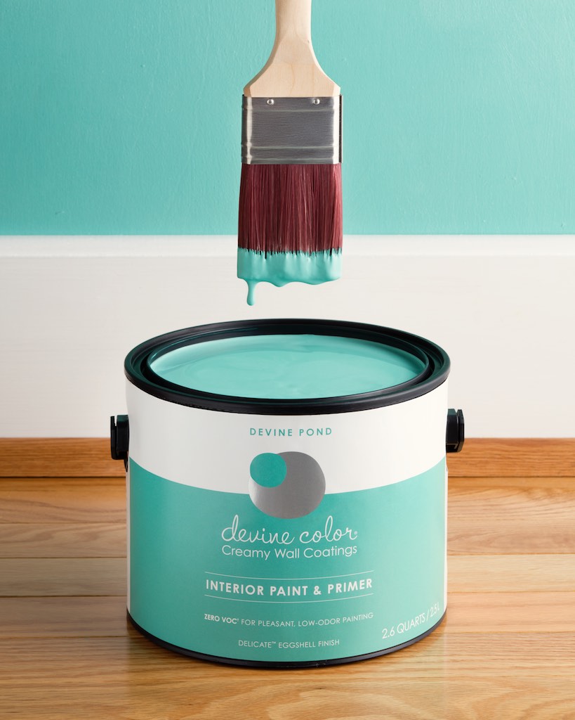
This shot incorporates a very simple set. sometimes the setting can have a powerful impact on the image. 

This shot incorporates a very simple set. sometimes the setting can have a powerful impact on the image. 

Looking Forward to the New Year With a Newly Updated Portfolio

Daniel Jackson December 30, 2017

As I have grown over the years as a photographer, the one constant is that there will always be new challenges to overcome. I think that might be the allure of making images, as soon as you start thinking “I’ve got this” the nagging desire to keep improving pushes onward. All of my old work starts looking stale, and I start thinking about big overhauls.

Here I am once again, staring at the same old product shots in my online portfolio for too long. So, behind-the-scenes I have been building up a body of new work over the past several months, some commercial work that hasn’t yet made it in and some work intended to show off my chops as an advertising photographer, and collecting it all into a fresh new product photography portfolio.

This shot was made on location. All of the styling tells a story and sells the product. In this case a mother and daughters boots are lined up to suggest that they have been outside playing or gardening. The fall colors in the leaves and pumpkins gi…

This shot was made on location. All of the styling tells a story and sells the product. In this case a mother and daughters boots are lined up to suggest that they have been outside playing or gardening. The fall colors in the leaves and pumpkins give a homey cozy feel. The dappled light suggests the sun going down. It all goes to make an inviting image full of warmth and nostalgia.

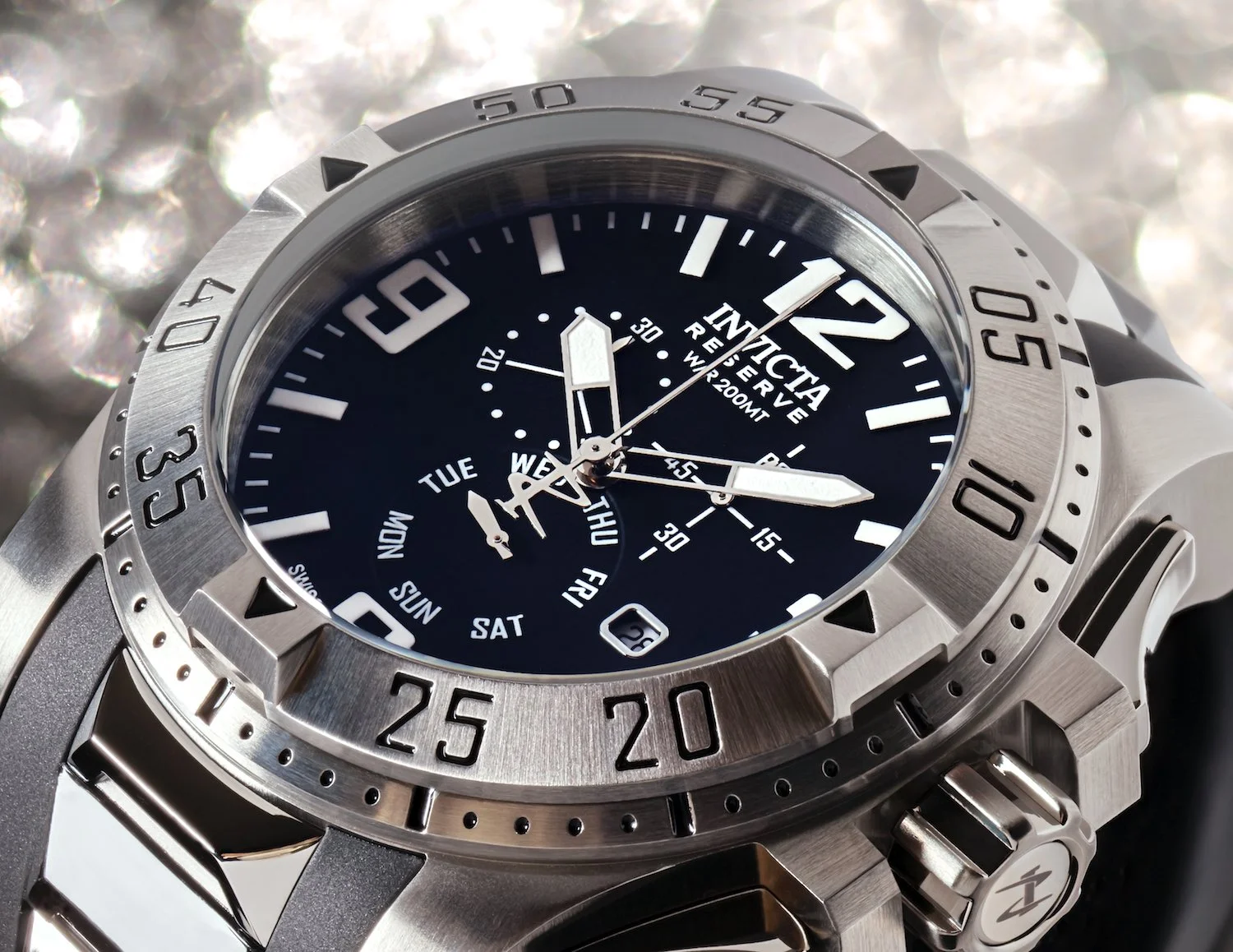
Product photography can be a lot of fun, people are often amazed at how much can go into a image of something tiny like a watch or ring. The setups in the studio get quite complicated because often these tiny still-lifes have reflective or mirrored surfaces, so not only are there plenty of lights but there are also cards positioned to give just the right quality of light to each part of the subject.

Here another tiny set tells a story. A well-worn work bench is home for some reliable tools that deliver day in and day out.

Here another tiny set tells a story. A well-worn work bench is home for some reliable tools that deliver day in and day out.

After I finish shooting, once each light and card has been finessed to make every part of the photo look its best, then the real work begins. Retouching for product photography is a ton of work. I use compressed air and anti-static cloths but on a tiny piece of jewelry, there is just no way to get rid of all of the dust, or horrible fingerprints that ruin the look of the stone. The only way to fix the tiny details is with hours of exacting work.

So, if you would like to take a look at all of the new work stop by my product page.


1 Comment
Jackson-photographer-commercial-pennsylvania-delaware  420.jpg

Surreal Portrait Project

Daniel Jackson November 5, 2017

Once in a while, as an artist I will have an idea that I need to explore, even when I have no clue where it might lead. It is a bit like an involuntary response, the idea sounds like fun so I start to play around with the ideas in my head till I have to do something about it and make something. This project is one of those, my long time friend Don Bethman who is an artist and illustrator was looking to work together on some bizarre portraits. Don graciously volunteered as the subject and we were off.

    Don collected up a bunch of props like, clothing, wigs and eyeglasses and we headed to my studio. The idea was to deconstruct the standard portrait photo, so, backdrops and lighting would stay fairly constant, even the model would stay constant but we would change the subject in ridiculous ways with the help of multiple exposures and photoshop.

    The lighting arrangement was really straightforward. The key lighting on all of the shots was a 60” octabank, which is just a large soft box. A small 16” soft box provided the rim light and a grid spot on the background helped with separation and a little drama. This configuration worked for all of the shots except for the old masters painting, which simply used the octabank. For this painting a single light was more in keeping with the Rembrandt style lighting.

    TRICLOPS

    You should know that Don’s usual state is with a lot less beard. He has been feeding and grooming it for months with these photos in mind, so there was plenty of reason to get a good photo just to memorialize the occasion of such a magnificent hirsute facial sculpture. So we began shooting without much in mind except capturing his beard in humorously awkward  pose. Within a few snaps I started seeing Don as looking a bit like a swami or guru, and started think a third eye would be funny. So we got the shots with the glasses on, then without moving shot Don with the glasses off. This way I could isolate the eye and place it on the forehead. Then we photographed the glasses against the background, including the sides, so I would have bits of glasses to work with in Photoshop.


Jackson-photographer-commercial-pennsylvania-delaware  419.jpg

BEARD GREMLIN

    This one was shot on the same day as the Triclops image. I was able to silently alter the colors to give it a bit of a different look. I was able to change the background and shirt, to try and keep the portraits from looking repetitive. It was a little bit of a challenge masking in the face and fitting it up under the mustache. The effect really started to come together when I used my Wacom tablet and used a paintbrush at one to two pixels and drew in hair. I then blurred by about a pixel with gaussian blur and added a bit of noise to blend it all in. In the end the repair was fairly invisible and really helped sell the illusion. I got the idea from a meme I saw a few years back of different celebrities that had been given the mustache hair treatment. I figured I would try and do it Don and make it as believable as I could.


Jackson-photographer-commercial-pennsylvania-delaware  418.jpg

CONJOINED

     Once I had the first two portraits finished the ideas just started coming. Almost as a challenge, what else would be fun to try and do with compositing and Photoshop? Two heads sounds like fun. Don had the idea to try two distinctly different personalities for each head so we styled each side differently . There was the life of the party on one side with crazy glasses, a messy beard and Hawaiian shirt looking like he is having the time of his life and the more straight laced quiet type looking annoyed. It was interesting to try and play off of the other characters emotions when there was no-one there. For the shirt it was a fairly simple workaround. We buttoned the two shirts together and safety pinned them in back, then pulled the shirt open enough to leave space for the other head then shot a bunch of each character so we had plenty of expressions to choose from.

Jackson-photographer-commercial-pennsylvania-delaware  417.jpg

BRAINIAC

    Don had an amazing pair of thick glasses that made your eyes look huge, and I figured it would be a perfect match for a gigantic super-villain sized noggin. I started by making the initial portrait. Then I made a number of close -ups all around the head. Then finally I got the size and shape of the head by taking pieces from other photos of Don’s head and using transform-warp to fit the parts into shape I wanted. Keeping the skin uniform was the biggest challenge so I tied it all together by using frequency separation and cloning just the skin texture to the appropriate spots. I Exaggerated the eyes a little bit more that the glasses. The mind control waves were natural and a product of the crazy glasses but if I had to make such an effect, I would use a paintbrush, gaussian blur and then use a layer mask to tone down the effect on the portrait.

Jackson-photographer-commercial-pennsylvania-delaware  416.jpg

VLAD THE IMPALER

    So this idea was probably the germ that started the whole project. Don and I had been talking about reproducing a portrait of the original Dracula with Don as the subject for a few years. Once we got moving on this project it made the whole idea far more within reach. We would use cheap costume elements that could be slapped together easily. Anywhere we could substitute something cheap for the real thing, we would. If you look closely the costume is composed of gumballs, cookies, bubble wrap , a paintbrush and some fabric. There was no sewing, only hot-gluing.


In the end, we both had a blast making the images. I could imagine them being used as stock for advertising, but I am not sure really how how I will use them. What I do know is it gave us both a chance to stretch our creative muscles. It isn’t how I typically work but it forced me to challenge my retouching skills, and hopefully opened some new doors and dusted off some old techniques that might shape my work in the years to come. Thanks for reading! If you would like to follow this project and how it develops it can be found here at: The Portrait Project.

2 Comments
Here it is, a very informal proof sheet I send my clients a jpeg that they can print out and add notes to. Fun fact, this is the first time I have used that meter in years, it makes a lovely prop for a blog post.

Here it is, a very informal proof sheet I send my clients a jpeg that they can print out and add notes to. Fun fact, this is the first time I have used that meter in years, it makes a lovely prop for a blog post.

The Architectural Scouting Shoot

Daniel Jackson October 13, 2017

When I have a client that is unsure about how many pictures they need of their architectural project, sometimes it can be useful to go on a scouting shoot. Scouting, is the practice of going on location with just the basics and getting some simple shots that the client can pick from. Then, once the client knows which angles they would like, the photographer goes back with all of their gear and makes proper pictures. Scouting can be a great way to insure that costs are kept down and the client gets exactly what they want by directing the client towards a concrete shot list.

    I find it best to travel very light, I will bring my full-frame camera and a zoom lens or my 24mm lens but I don’t bother with a tripod or lighting. I save the big camera bag for the day of the big shoot. The idea is not to dazzle your client with perfect shots here but to give a rough idea of what to expect from the final images. I like to give a sense of the depth of field so I will stop down the lens and go with a higher iso. Since the images will never be seen at full resolution, I don’t worry about noise. The idea is to demonstrate the best angles and give the client some options.

    Once you have collected the images they should be provided to the client in low-res. I will usually provide the images as part of a proof sheet that they can print and make notes on. If you are only delivering a few images make sure they are watermarked. It is important to make it very clear that these images are proofs and not for use. Scouting shots are the property of the photographer, and since they are not representative our work and professional standards they should never be used publicly.

    Another reason to make it very clear that scouting images are proofs, is to keep things organized. Say your client asks for a scout, you shoot 10 pictures, they ask you to go back and make finished images of all 10. If the scouting shots are on your clients hard drive along with the finished pictures, there is the possibility that the wrong image will be used. If they need an image for an award submission or a magazine they won’t remember the scouting shoot and will likely use the first image that looks remotely like the one they are looking for. Accidentally using the scouting shots is a bad outcome for both of you. It also deters the client from using images they haven’t paid for, either accidentally or in some cases it can protect you from theft.

    If the location is nearby and the client feels they need it, I will usually provide the scout free of charge. I do this because the scout is usually as helpful for me as it is the client. Getting in the space can allow me to start thinking about what the challenges of the upcoming shoot might be. There might be a room that is impossible to light without extra gear, or if the space is uncommonly easy to light I wont have to bring quite so much equipment on the day of the shoot. 

    I try to work quickly and creatively on a scouting shoot, I am looking for the best way to tell the story of the space in as few images as possible. But, I also want to try for some more experimental images that the client may not have thought of. 

    In the end It makes good sense for me to provide a scouting shoot because seeing examples and picking the shots takes the risk out of the equation for the client. And if the client is confident that they are going to like the results they may purchase more images. I also find with scouting that clients are more likely to be happy with the finished product and hopefully more likely to call back for their next project.

    Do you have experience with scouting architecture before a shoot, either good or bad? Do you charge for the service? I would love to hear your opinions.

4 Comments
← NewerOlder →

Search Posts

Featured Posts

Featured
Group Photos
Apr 2, 2025
Group Photos
Apr 2, 2025

Architectural photography is all about providing good consistent results. Here are multiple views of a project to give an idea of what a whole shoot looks like.

Apr 2, 2025
Creative17.jpg
Oct 17, 2021
My Really Right Stuff TVC 24L Review
Oct 17, 2021
Oct 17, 2021
Iphonebefore.jpg
Aug 27, 2019
A Little Look Behind The Scenes Of An Architectural Photo Shoot
Aug 27, 2019
Aug 27, 2019
Daniel-jackson-Apples-Commercial-Photographer-01.jpg
May 27, 2019
What does a photograph cost?
May 27, 2019
May 27, 2019
CoverEos.jpg
Nov 3, 2018
Eos Photo Magazine Article
Nov 3, 2018
Nov 3, 2018
Philadelphia-cookbook-photographer-Daniel-Jackson-04.jpg
Aug 27, 2018
Marketing With Photos 101 (Can't Afford Photography? You are probably doing it wrong.)
Aug 27, 2018
Aug 27, 2018
90mmtsevs90mmtse.jpg
Mar 2, 2018
The New Canon 90mm 2.8l ts-e Macro Tilt-Shift Lens Vs. the Old 90mm ts-e
Mar 2, 2018
Mar 2, 2018
French-flag-architectural-photography.jpg
Feb 25, 2018
Architectural Exterior Photos - and how to fix them when they go wrong
Feb 25, 2018
Feb 25, 2018
Jackson-Photographer-philadelphia-Delaware-fine-art  428.jpg
Feb 9, 2018
February Exhibition - Settled
Feb 9, 2018
Feb 9, 2018
photographer-Jackson-advertising-pennsylvania-delaware-product-paint.jpg
Dec 30, 2017
Looking Forward to the New Year With a Newly Updated Portfolio
Dec 30, 2017
Dec 30, 2017