Color casts are tints or washes of color in a photographic image that are often unwanted and have the potential to ruin an otherwise excellent photo. They can affect the whole image or be broken up into local areas. Casts are a real pain for all photographers but are an especially difficult issue for architectural photographers. The reason for this is that light sources in a typical interior often differ greatly in color. for instance natural daylight is on the bluer side of the spectrum than the warmer more orange incandescent bulbs commonly used in household fixtures. Fluorescent and led bulbs can be warm or cool and have strange gaps in their color spectrum that can be difficult to correct, complicating things further.
When photographing an architectural interior you will likely find all of these mixed-color sources in one room, causing pools of distinctly different colored light. This can obscure the proper color of the finishings in the room and confuse the viewer of the image. In a small interior, the solution may be changing a few bulbs to match the daylight color, but this will hardly remedy color issues in larger rooms where all of the fixtures could not be changed easily without a great expense of time and money. So architectural photographers need strategies to manage their color and guarantee that their clients get the results they desire.
step 2 Calibrating the monitor. If your monitors color is off, so are all of your files.
To avoid huge overall color issues, one of the first and most important ways photographers can get their color straight is to make sure that their equipment is calibrated. Without calibration accurate color is a guessing game, is too red, purple, green? Who knows? For example, imagine that your computer monitor is a little bright and slightly purple, if you were to work on those images in photo editing software like Photoshop or Lightroom you would likely correct the brightness by darkening the file and fix the purple tint by removing purple or adding green(purple’s opposite). Then every image that you produce by this method would be off. And when you send the files to the printer you will likely be confronted by less than perfect results, even though the images looked amazing on your monitor. Compound this by the numerous ways that a monitor can be off, like contrast, brightness, color and saturation and you begin to get the idea.
here is the monitor calibrator going through its paces.
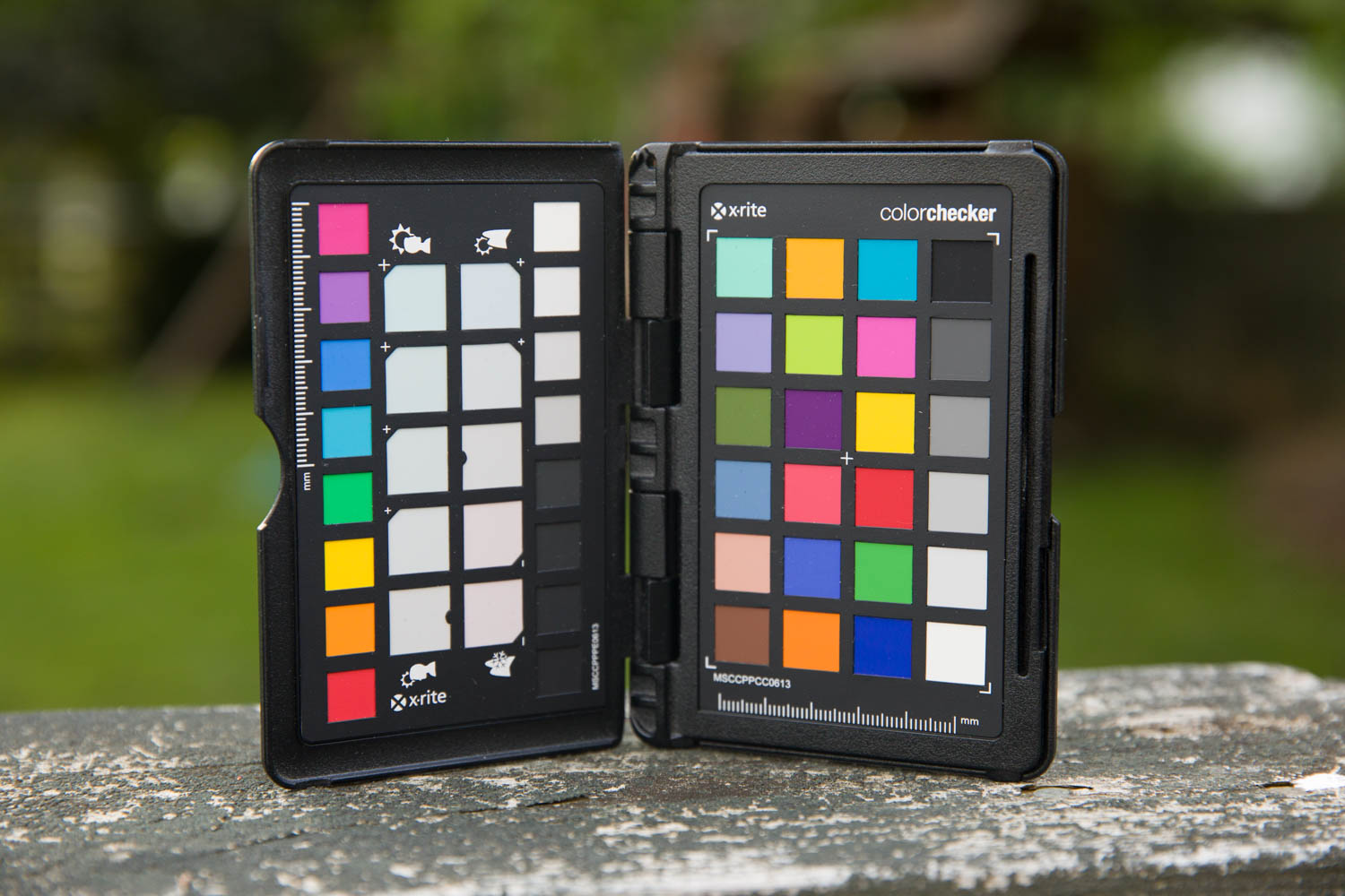
There are devices that help calibrate every step in a photographer’s workflow. In practice it works a little like this. The photographer, takes a picture of a color card that uses industry standard colors. Then using software, the computer looks at the file and determines how close each of these colors in the digital file resemble the standard colors. Once the differences are detected, a profile is created that compensates for each of these color changes. This step helps diagnose any quirks with the camera’s color, in different lighting situations. The profile gets applied to each image during processing. This leaves the issue of the monitor because even if the files are perfect you would still adjust them to compensate for a poorly calibrated monitor.
To get the monitor set correctly you can use a monitor calibrating tool. This is a light reading tool that can detect less-than-perfect color. It is like a camera, that sits directly on the computer monitor screen. When activated, the software runs through a sequence of colors and the device reads them trying to detect differences between what what is displayed on the screen and what is read by the device. When a profile is created it is then applied to the monitor to insure that all of the differences are corrected for. For print, there is even an additional profile that can be made using a reader to measure the density of the inks to insure accurate color. Once you have taken the step of calibrating, a simple gray card will yield excellent results. However it is important to calibrate every few weeks or so because all of the elements will drift over time.
Here is a typical mixed light photo, the light from the window is cool and the area around the lights is yellow-orange. A gray card reading helps a bit but as you can see here the color is good in some areas and not others.
A calibrated workflow insures that even though there are many elements that must work together, if everyone involved with a project is working with a calibrated system we will get good results. Since I have switched to working with a calibrated workflow I consistently have better results when working with printers and posting to websites. There are just far fewer unpleasant surprises.
Colorspaces are another way to insure that there isn’t any loss of color fidelity in your images. In this case when a file is sent from one individual to another. A colorspace refers to the amount steps or gradations between colors in an image. Photographers are better off working with more colors in a file because the files are more robust and can take more editing. Colorspaces can be huge, some are even so large that no monitors can display the full range contained in the file, in fact very few monitors can display the full range of colors in the most commonly used colorspaces. When professional photographers and designers exchange files they are usually safe even when using larger color spaces. But, as soon as the file might be viewed on anything other than professional image editing software the results are unpredictable.
Here I have begun to adjust for the yellow lights, by using color balance.
The most common colorspace is one of the simpler web-based colorspaces called sRGB. sRGB was developed as a standard to insure consistency of colors on the web. When an image in a large colorspace like Adobe RGB or ProPhoto RGB gets converted in a consumer grade image viewing program to the sRGB that it uses to display images, it can cause all sorts of trouble. Your carefully color balanced and calibrated files will be displayed completely out of sorts, if it looks good it is simply luck. For this reason when saving and working in a lossless format intended for other imaging professionals you should use the more robust Adobe RGB. But when saving Jpegs for a client you are likely better off saving in the lesser sRGB to insure color consistency. This is because all image viewers speak sRGB but only a few are sophisticated enough to take a different type of colorspace and display it accurately. So do your editing in ProPhoto or Adobe RGB then as a last step convert the image to sRGB.
Here I have inverted the mask from white to black, hiding the color adjustment.
Calibration and color space are great solutions for global color issues, but that still leaves us with the problem of localized pools of color that are a result of mixed light sources. In limited amounts, mixed color lighting can add some drama or warmth to an image, but when overdone it can look ugly and amateurish. There are a couple of solutions for photographers and retouchers that can help fix mixed light: masking and adding more lighting while shooting.
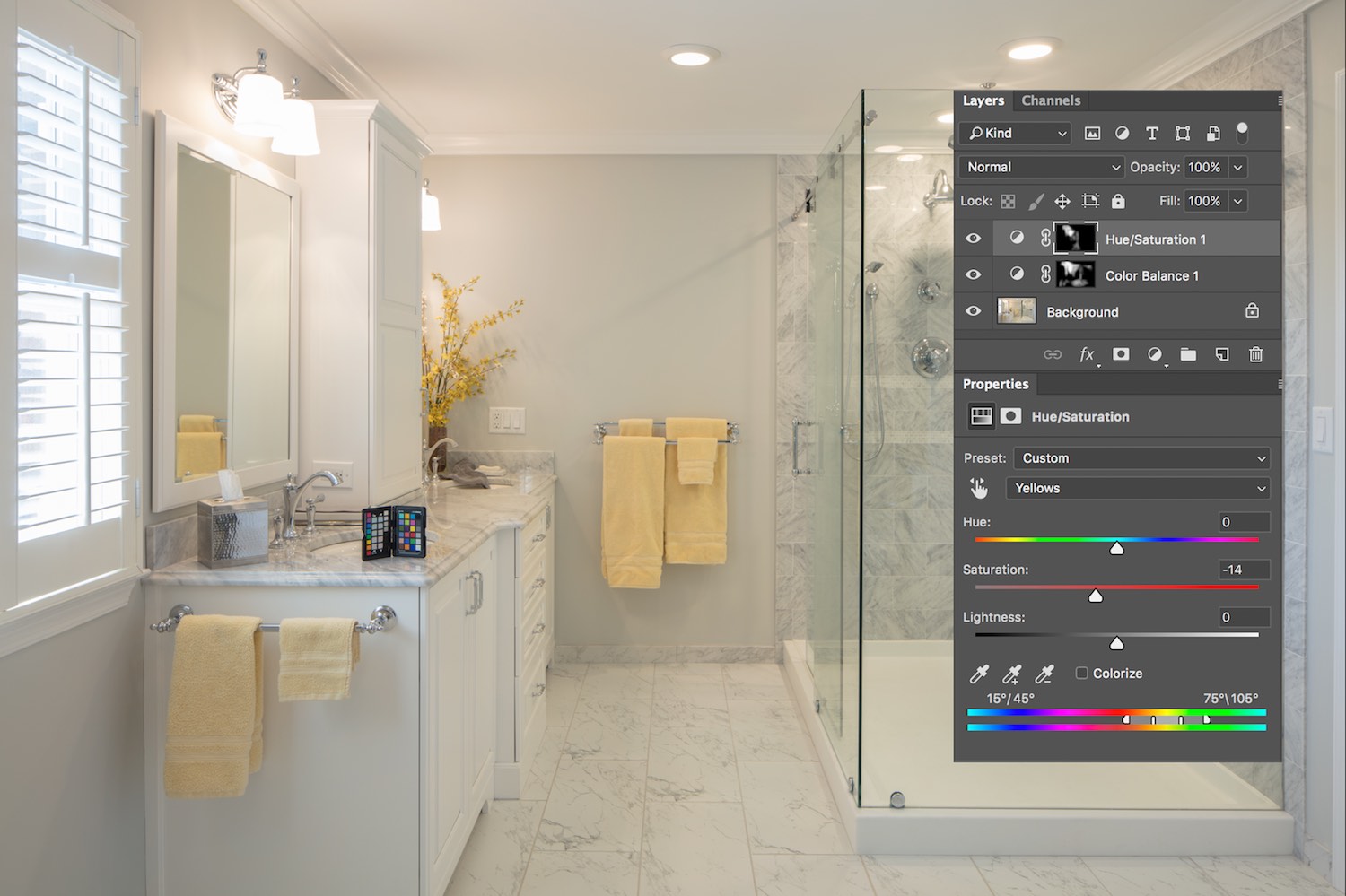
Masking is done in post production, after the image is shot, and is a way of applying localized changes of color. The concept behind the mask is that an adjustment can be made on a layer in Photoshop and then selectively applied. So for instance, I can add a color balance adjustment layer and make an adjustment that corrects an issue in part of the photo. By default, the adjustment will be applied to the entire image but, I can change this by clicking on the white square in my layer and inverting the mask by holding command and pressing I (for invert). Once the mask is inverted and it’s color is changed to black you reveal the effect by painting with a white brush on the black mask. In this way fine adjustments can be made
Finally I have painted in the mask with a white brush to reveal the color adjustment. I wasn't quite happy with just the color balance adjustment so I added a hue/saturation adjustment layer with the yellows and reds desaturated and painted in the effect in the same way as I did the color balance. I think it looks a whole lot better.
The other solution to mixed-color lighting is to bring lighting to the shoot, and light everything with daylight-balanced flash. If the camera is fixed to a very steady tripod, the lit exposure and the ambient exposure with the practical lights on can be used together to correct the color casts. The lit frame can be used with the “color” blend mode so that it doesn't affect the exposure, it just transfers the accurate color. Then the opacity can be dropped to a level where the effect is natural looking. After that, by using a copy of the lit frame in the “normal”(affects color) or “luminosity”(doesn’t affect color) mode you can decide how much fill to add. This has the effect of removing the cast but can be dialed in to exactly the level you desire.
Here, I applied a final global color balance and the result is not bad, certainly better than before.
Here finally is the image of the room lit with daylight balanced strobe, mixed with the ambient light. I prefer the look of this method. It keeps the lights and window from being too "blown-out" and allows me to adjust the levels to my liking in post.
Thanks for visiting, perhaps you have some tips of your own that you would like to share on color casts, I would love to hear them. I also did an embarrassingly brief explanation of masking, if you would like to hear more on making selections for masking let me know and it will be the topic of an upcoming entry. If you have a moment, stick around and see some more of my blog posts, I have some recent articles on cutting photography costs by splitting production costs and another on what to look for when searching for an architectural photographer.


