Ever wonder why so much food photography is just ho-hum? It is not the camera or fancy equipment, it is not even the food. I’ve seen enough bad photos of pretty food to know that . No, it is knowing what kind of light is appropriate for your subject.
Somewhere along the way in our evolution as photographers we all realize that the crummy built-in flash is the reason our photos look terrible. The reason the built in flash is so bad is that it is tiny and very close to the lens. This accomplishes two things, it makes really intense sharp shadows and flattens out whatever you are shooting. Camera companies know that most people just want a picture and don't care how it looks, so they throw the little flash on the camera and thats that. The solution to crummy on camera flash is to get your light off camera, instead of a tiny flash with sharp shadows use a big light, like an umbrella. It is one of our first steps to becoming a photographer. And we all know what happens when we stop using the on-camera flash… everything looks better.
First, lets look at why a big light source off-camera but close to the lens is so popular. The large light source softens shadows and the location near the camera flattens things out, not as flat as on camera but much flatter than if the light source was more to the side of the subject. We love this lighting because as photographers we are suckers for a great portrait. And, this combination of soft shadows and flat lighting is really flattering for all sorts of subjects. It kills detail like pores, pimples, scars and wrinkles, it even tones town a severe nose or an over prominent brow. Everyone looks good lit like this but it is especially flattering for women. You could be excused for using this style of lighting for pretty much anything because it seems to work magic. I would even go so far as to say it is rare to see photographers using anything else.
The character of a face doesn’t lie in it’s texture, it is the relationship of the eyes to each other, it is how far the nose is from the mouth, it is the perfect smile, in short, it is the likeness of the sitter. The texture of the pores and wrinkles are details we would rather forget, so hiding them focuses our eye on what matters, the face. So, when something works so well for so many situations it is easy to fall into believing that this is great lighting and if it looks good on people it looks good on everything. The problem, is that hiding detail isn’t always the goal.
That brings us to food photography. When we consider what makes an appealing food shot, it is all about texture. We are limited to a visual representation to stimulate our audiences appetite so we want to make the most of every detail. One of the toughest subjects for a food photograph is when the subject lacks contrast, like a flaky pastry. Especially one with very little variation in color. You could add contrast in the styling, but without adding anything to the pastry, how can you add drama and appeal? The answer is proper lighting. Rather than the flattening that occurs with a big light source next to the camera, we move the light down set and start to see the shadows lengthen.
We tend to think of lighting in fairly conventional ways, and this is where things usually go wrong. Imagine placing the light near the camera and photograph a plate of food, this would flatten the texture because the shadows would fall behind your subject and be hidden from the lens. Now imagine placing the light opposite the camera, on the other side of your subject, the light can now scrape its way over the food revealing all of its texture. And rather than flat lighting, the shadows fall toward the camera so the shot is dramatic and contrasty.
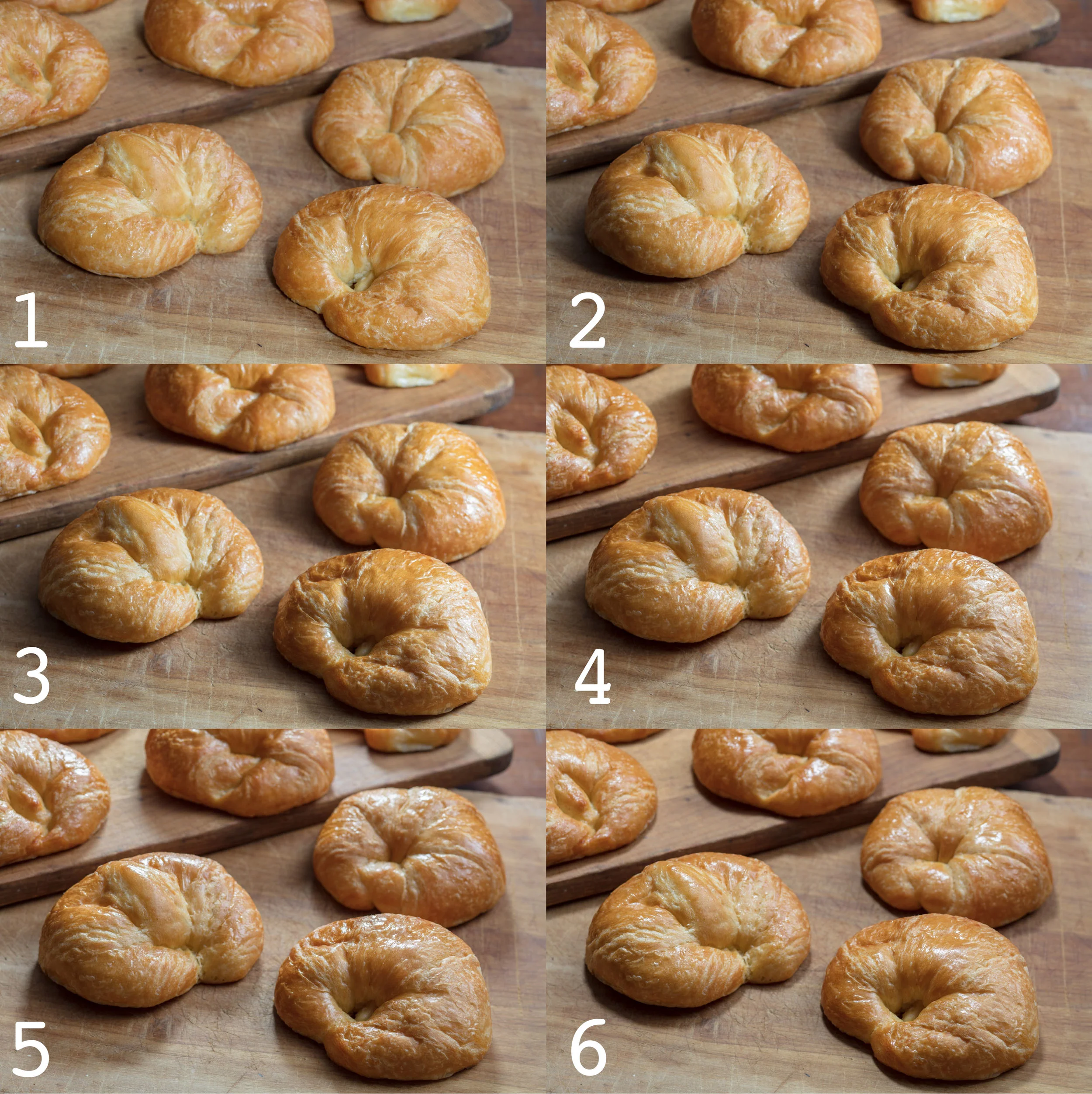
1. This shot was made with the soft box next to the camera, notice how flat it looks. 2. This time the key was placed at a 45 degree angle, it is getting better. 3. Now we are seeing some drama and texture in this shot which was made with the seftboz at 90 degrees to the side. 4 Seems strange, but the light is actually behind the subject pointing back at a 45 degree angle and the food looks amazing, I like the shadows, might be my favorite. 5. This one is directly behind the subject and it looks really appealing, compared to image 2 or 3 the texture is much more pronounced. 6. I was surprised by this one, the light is over the subject looking down. I thought this one would be good but it feels artificial and is no comparison to 4 or 5.
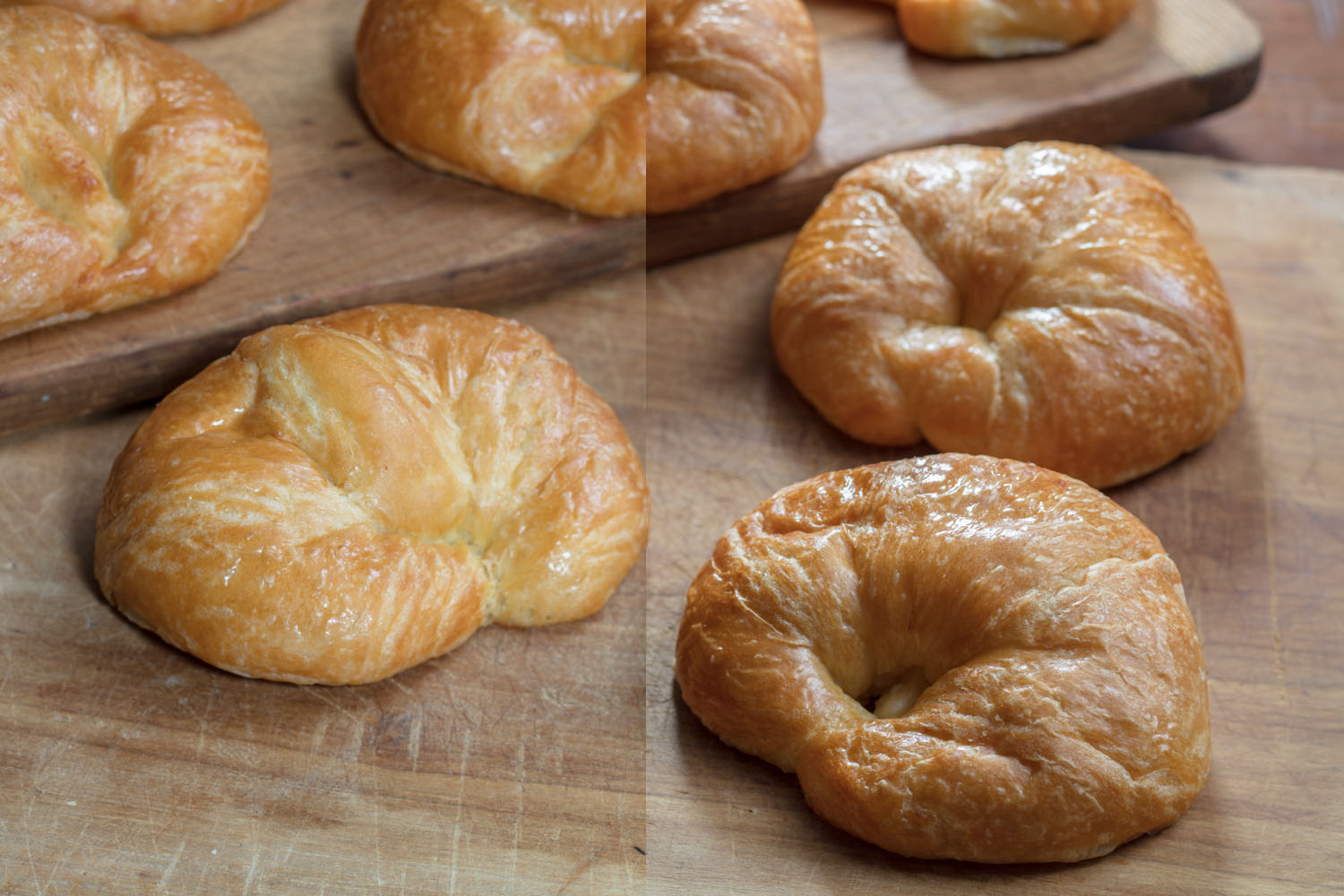
To illustrate this idea I have some croissants and a wood cutting board that is remarkably similar in tone to the croissants. Not very interesting to look at, but that is the point. Without conveying texture you are doomed to a lackluster photo. You have some simple beige blobby shapes on a beige background. To demonstrate I have made several images. First, I start with a simple glamour lighting, nice soft light, close to camera and a little fill bounced off of the ceiling, both lights are speed lights the key is in a small softbox. Then I work my way down set, where I end up opposite the camera pointing the light directly at the lens. As you can see, the images start out flat and become more dramatic and show more texture as the light moves farther from the camera axis.
Here is the winner #4 , the light is actually behind the subject but really does a beautiful job of popping the texture and separating the croissants from the bread board which is very similar in color. The best angle turned out not to be directly opposite the camera but aimed in at a 45 degree angle from down set. It shows even when armed with the proper way to light there are always surprises and it is your job as artist to experiment a little.
A helpful way to visualize is to use a flashlight, try aiming it at your subject to bring the most texture possible. Usually this is at a low angle skimming across the surface, just enough to make the detail jump out. For the ideal food photo you want to use your lights or the natural light to accomplish the same, to bring out all of the texture.
Applying this kind of lighting is super easy even when using natural light, just look for a spot near the window, place the food in between you and the window and shoot. Be careful when shooting in natural light to shield your subject from the interior lights or turn them off completely otherwise you might end up with a nasty color cast that is hard to remove. Another issue when using this technique is to watch how dense the shadows are, in a pinch you could use a napkin just below the lens as a simple reflector, to bump some light back into the shadows.
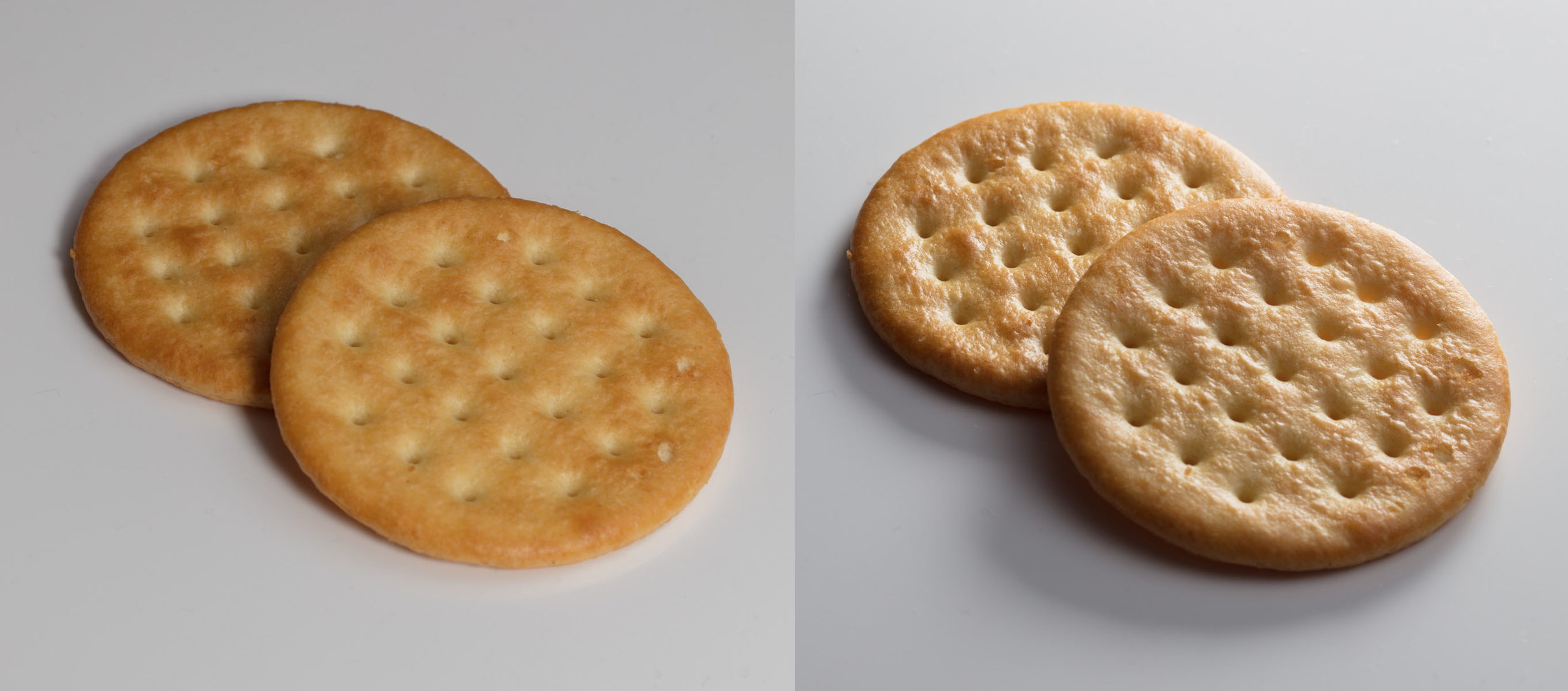
Just one more demonstration. The image on the left was shot in what would be lovely portrait lighting, but does nothing to show the texture. The image on right was shot with a raking light, low down, so that it skims over the surface and reveals all of the texture.
Remember, it can be easy to fall into patterns and use inappropriate light for our subjects. Be open to all sorts of lighting but consider what the light is doing, is it revealing texture or flattening it? Is your lighting working for you or against you? Do you have any interesting stories to share about food lighting? I would love to hear from you.


