
If you are searching around, trying to find good architectural photographers for hire and you have come upon this page, I have some good news for you. You can pretty much stop your search, you have found exactly what you are looking for. Well, maybe. Just in case I am not exactly what you are looking for, here is how you can train yourself to spot a winner and maybe who to avoid.
In all seriousness though it can be difficult to tell the difference between photographers, especially when looking at a bunch of different online portfolios. When I first started looking at other websites I was really wowed by almost everything. Over time I have gotten better at quickly looking at a portfolio and determining how skillful the image maker is by following a few simple steps. So, the first point is to know what you are looking for or to describe what would be the best possible results you can expect. I think that would be for everything in the picture to look it’s best, yet to still feel natural enough to be believable. There are many factors that add up to making a good picture, it is my goal to point out a few of the more important ones to help you in your quest. If you want to be an educated consumer all it takes is knowing what to look and to see how each photographer tackles the challenges faced in a typical architectural shoot.
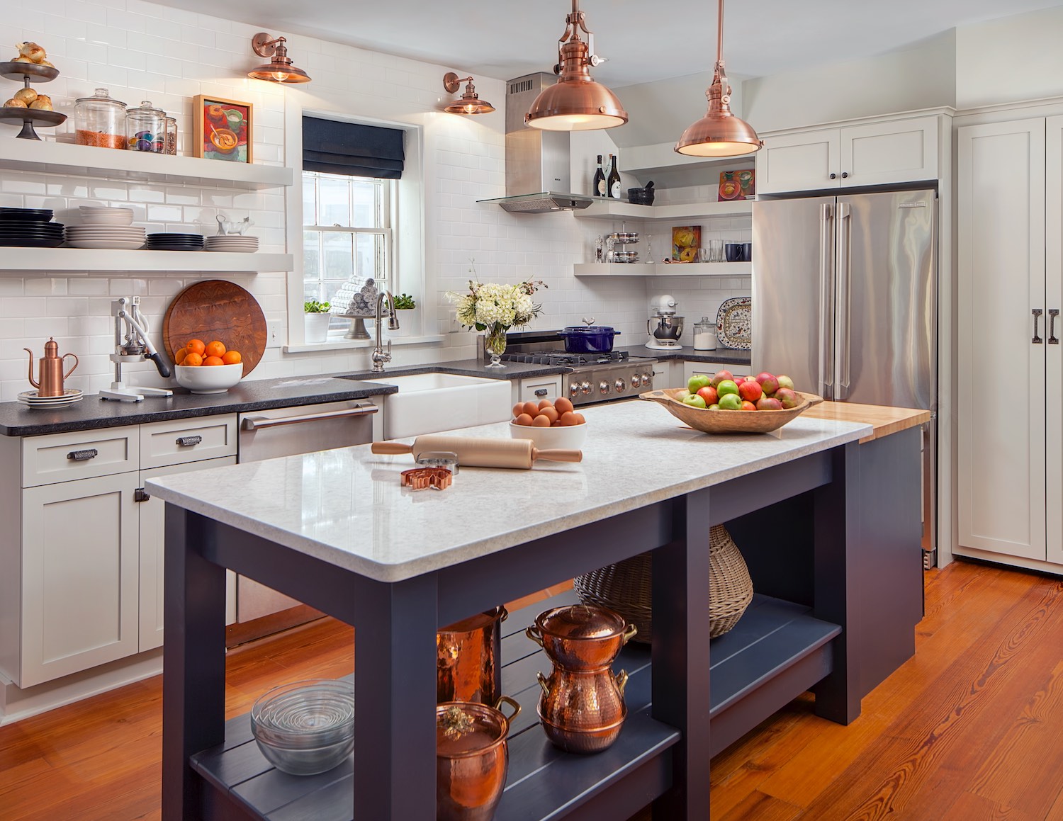
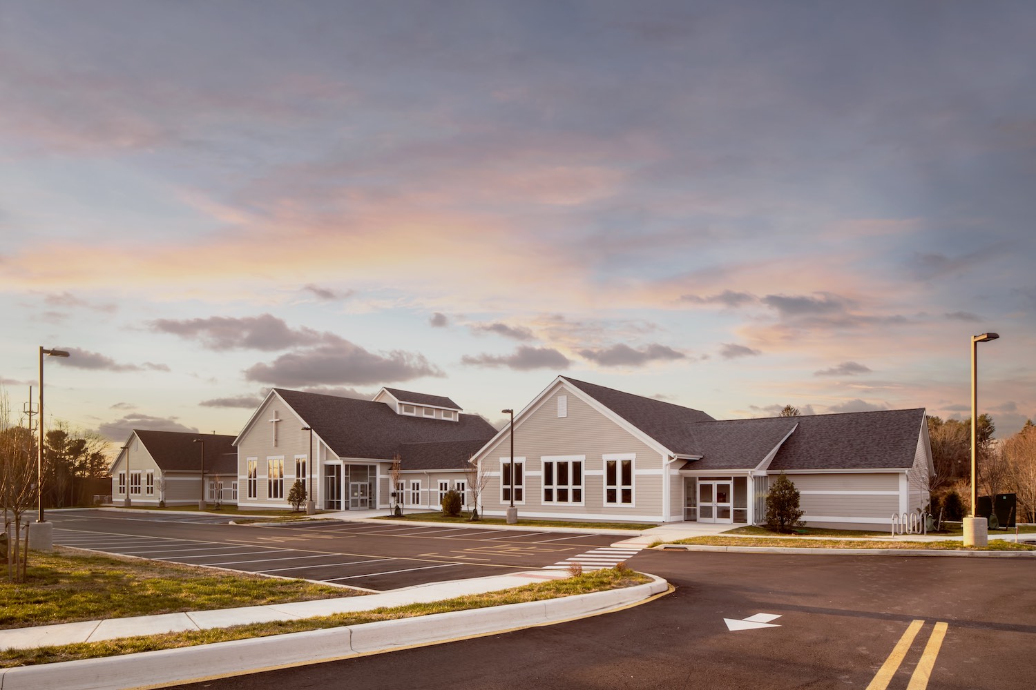
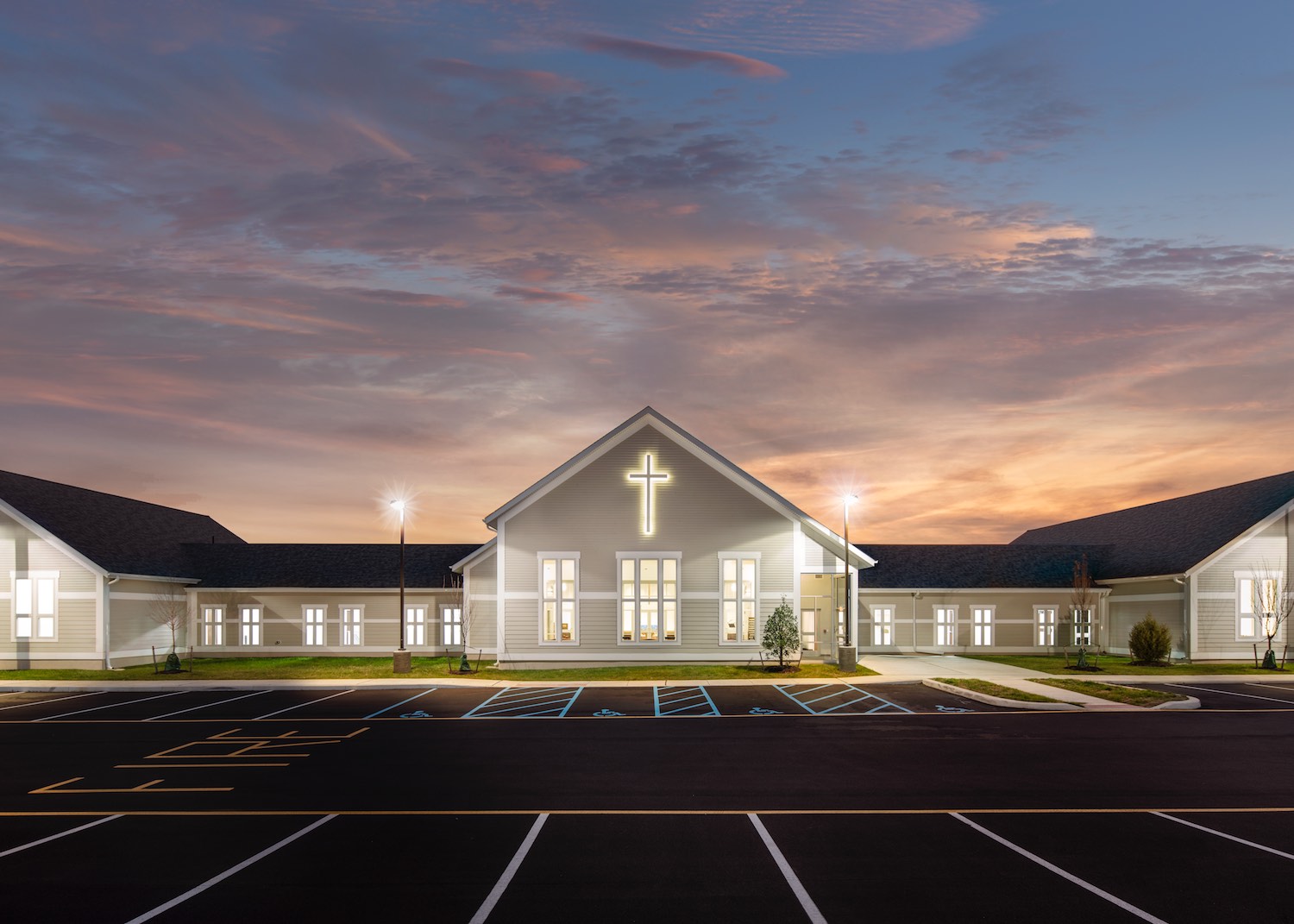
A good place to start your observations is the windows. Windows are traditionally a difficult problem for architectural photographers. This is because the dynamic range in most architectural images is too great to be captured easily in one image. What this means is often the windows are bright white and all of the detail outside and in the muntins and mullions are wiped out in a bright haze that surrounds the windows. A careful look at the windows will reveal if the photographer is able to handle this issue. In a well done image all of the architectural detail in the window frame should be intact. Plus there should be no glare or haze surrounding the window. Sometimes the outside vegetation or architecture is visible if the view is nice and sometimes the windows are allowed to go white if the view doesn’t help the image, the important factor is that none of the detail of the design should be lost.

This is a blown-out window. The information outside the window is gone but more importantly the window architecture is missing in spots and there is considerable haze all around the window.
Another area of difficulty for photographers is color casts. A color cast is created when different colors of light are present in the same photograph. Something to look for is to make sure the color of the light is consistent throughout the shot. Handled poorly it can be an ugly mix of yellow interior lights and blue window light clashing and ruining the image. The ideal architectural photograph will feel clean and well lit and the color will be flattering to the furnishings in the room. Keep in mind that some variety of light color can be a good thing and suggest the warmth or comfort of an interior. But, too much and it sucks the life out of all of the colors. If the light is mixed consider how attractive the results, this can really be a matter of taste.
The "natural" quality of a photo can be spotted by a close look at the textures in the room or again at the windows. One of the options for correcting the many different issues that an architectural specialist runs into is to combine exposures using tone mapping or exposure fusion, in some cases these techniques can yield great results, but in others it can be downright ugly and unnatural looking. If this technique is poorly done, the image has a surreal contrasty look and the colors get strange and intense. The technique is great for bringing out detail but it brings out detail everywhere, even when it is not wanted. Textiles and textures take on a grimy, crunchy quality. An easy place to spot bad tone mapping is to look at the walls, they should look fresh and white not grey. Another side effect can be halos, which are contrast that is applied to the entire image except the transitions, you can see them especially well around the windows. Ideally you shouldn’t see any artifacts of this technique. 5 to 10 years ago this “high dynamic range” technique was all the rage and it looked cool. Nowadays it looks dated and unnatural, if you want to use images in your portfolio for years to come, the less of this technique the better.

An especially ugly HDR image, you can see that it fixes the issue with the window but everything looks grimy. Another issue is that the colors are exaggerated in an unnatural way. This image is decidedly cheaper looking than the first image done with supplemental lighting.
Shadows are another place to look to determine if a photographer is an ideal fit for you. Are the shadows too crisp? Do they dominate the look of the shot, this can be a side effect of bad tone-mapping or HDR. A natural look is what is best here, the room should look a lot like it looks in real life, or maybe a tiny bit better. Some architectural photographers bring extra light to bring out details and soften harsh shadows, or block some windows to keep the light directional and avoid flat dull light.
Sometimes it can be useful to look for the worst image in the portfolio. In a portfolio, the best quality work has been picked to represent the photographer. So if a work is less than perfect it might show that your results with that photographer might be similar.
I hope I have provided you with some insights on how to look at architectural photographers for hire and see the differences in their work. It can be difficult to see the differences if you don’t know what to look for. There is a very vast range of quality in photographic imagery, hopefully knowing to look for a few subtle things will help you make a informed decision that can have a huge in the quality of imagery you get to document your work. If you are located in the Philadelphia area you might face additional challenges finding a great photographer, I have produced a guide to help you through some of the challenges you may face hiring an architectural photographer in Philadelphia. To illustrate the vast expanse in quality between good and bad architectural photography I have a short page of before and after images that might help illustrate many of the ideas I have presented here. I also created a head to head challenge between several types of image processing from HDR to Lightroom to lighting that you might find informative. All of the most common techniques for coping with dynamic range are represented there. Thanks for reading about how to find an architectural photographer. Please let me know if you have any questions or comments, I am glad to help. Also, if you are an architect, designer , builder or decorator with a project that you need to document, I would love to hear about it. Contact me for a free quote. If you would like to see more of my work please drop by my portfolio page, it is full of interior design, and architectural photography as well as one of my other passions, food photography.